Sporty TV
Sport is movement.
SPORTY TV is a modern sports channel specializing in sports broadcasts using an automated transmission system. It also produces its own magazines focused on mental coaching, trends, and a healthy lifestyle. Therefore, the visual identity of SPORTY is defined by an emphasis on technology and analysis as attributes of modern sports.
Sport is movement. Movement occurs in space and time, fueled by energy. The identity of SPORTY is based on those three interconnected variables that define sports activity: Space – Time – Energy.
Read more
Energy
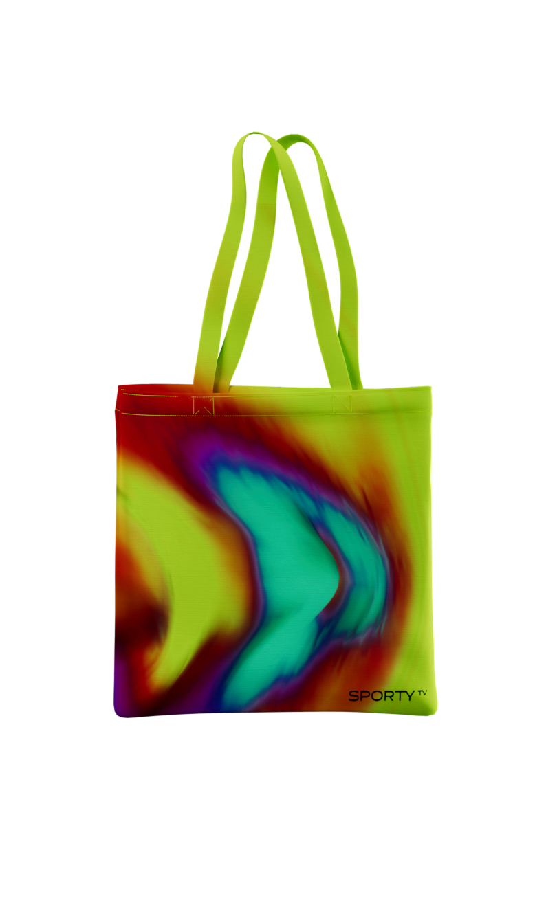
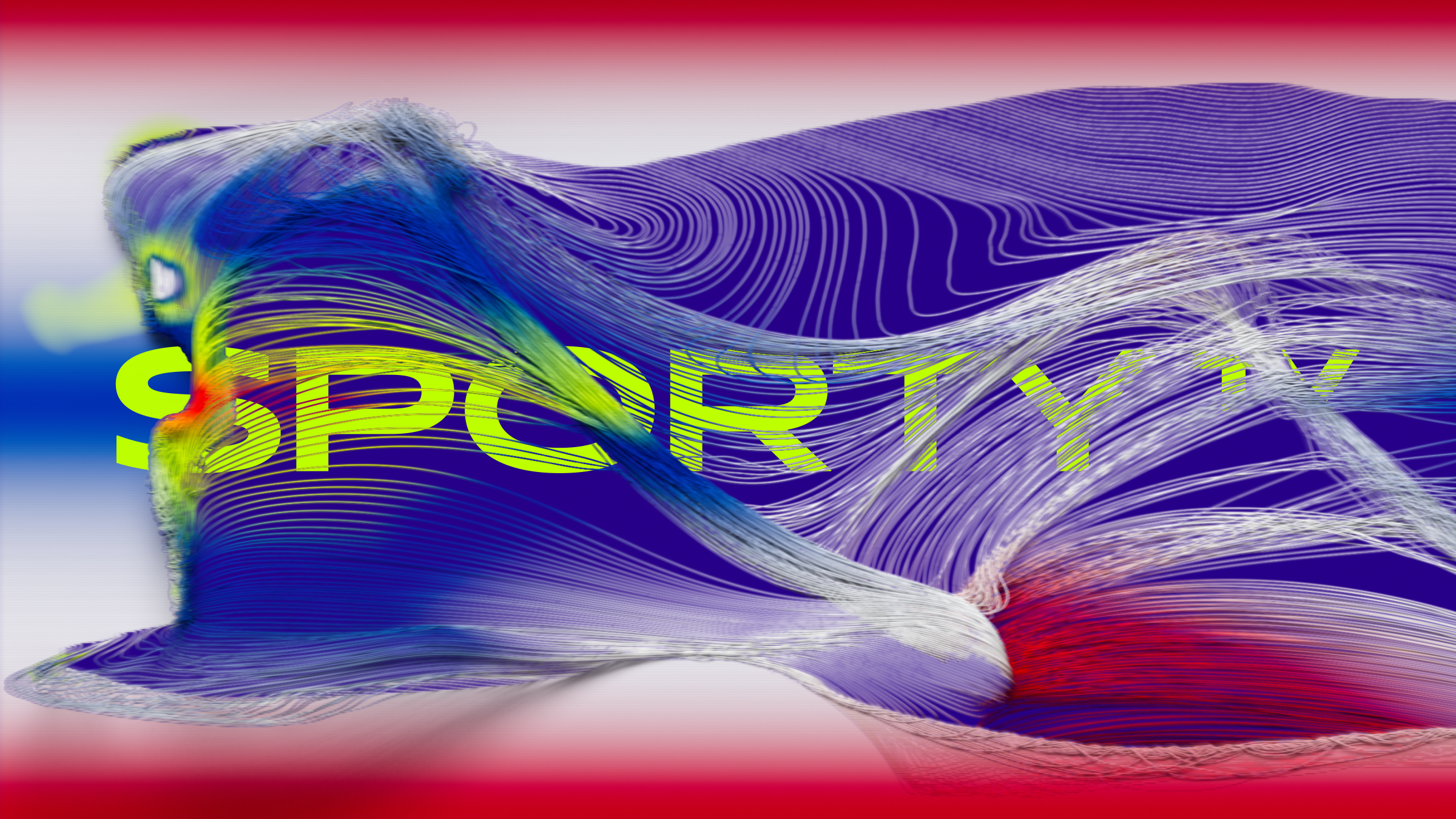
Sport today is more and more about science, and thorough analysis is the key to achieving better performances. One of the used visualizations is a heat map that displays the energy expenditure of sports activity, shown using a color gradient. Energy analysis creates a unified color spectrum for the channel’s jingles.
Space
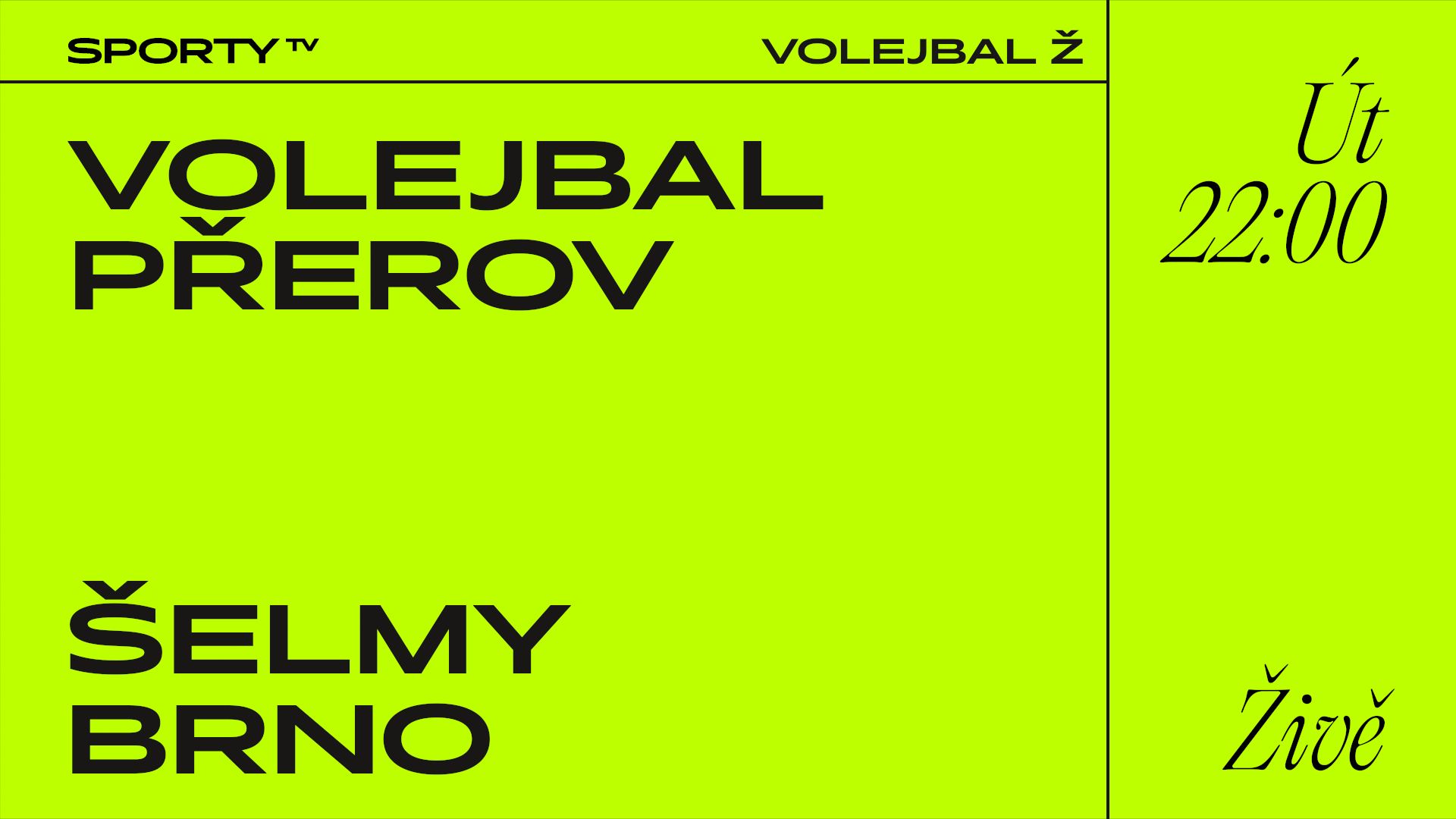
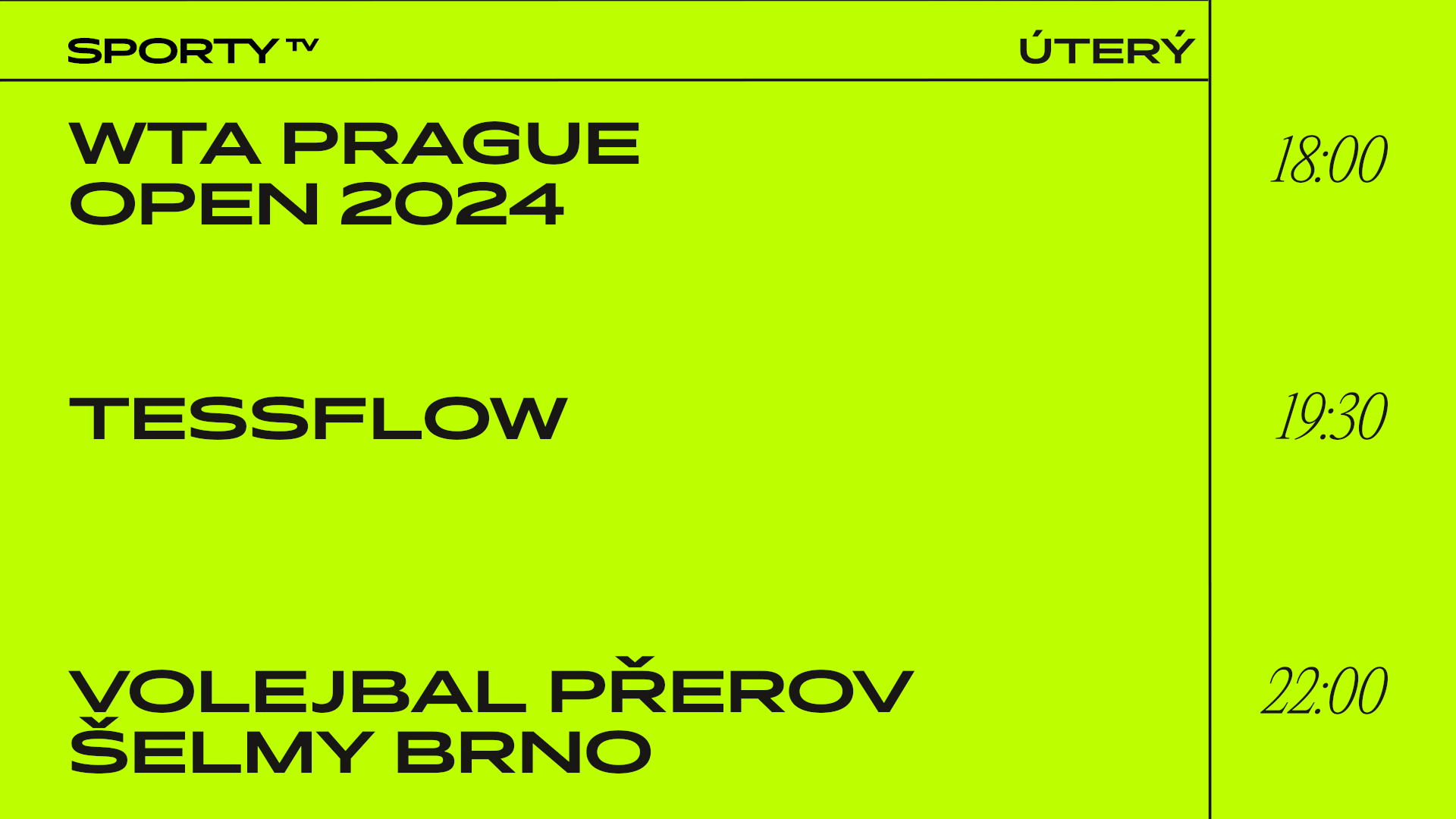
The field is a space divided by lines. On most sports fields, there is a T-shaped perpendicular line that divides the area into three parts. Within SPORTY’s layout, these three fields are reserved for category, title, and program time.

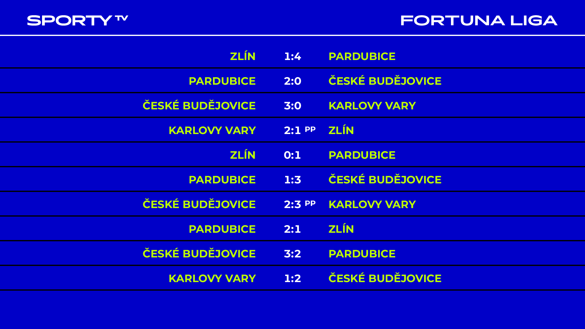
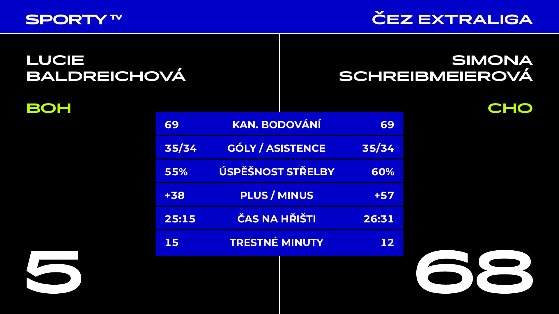
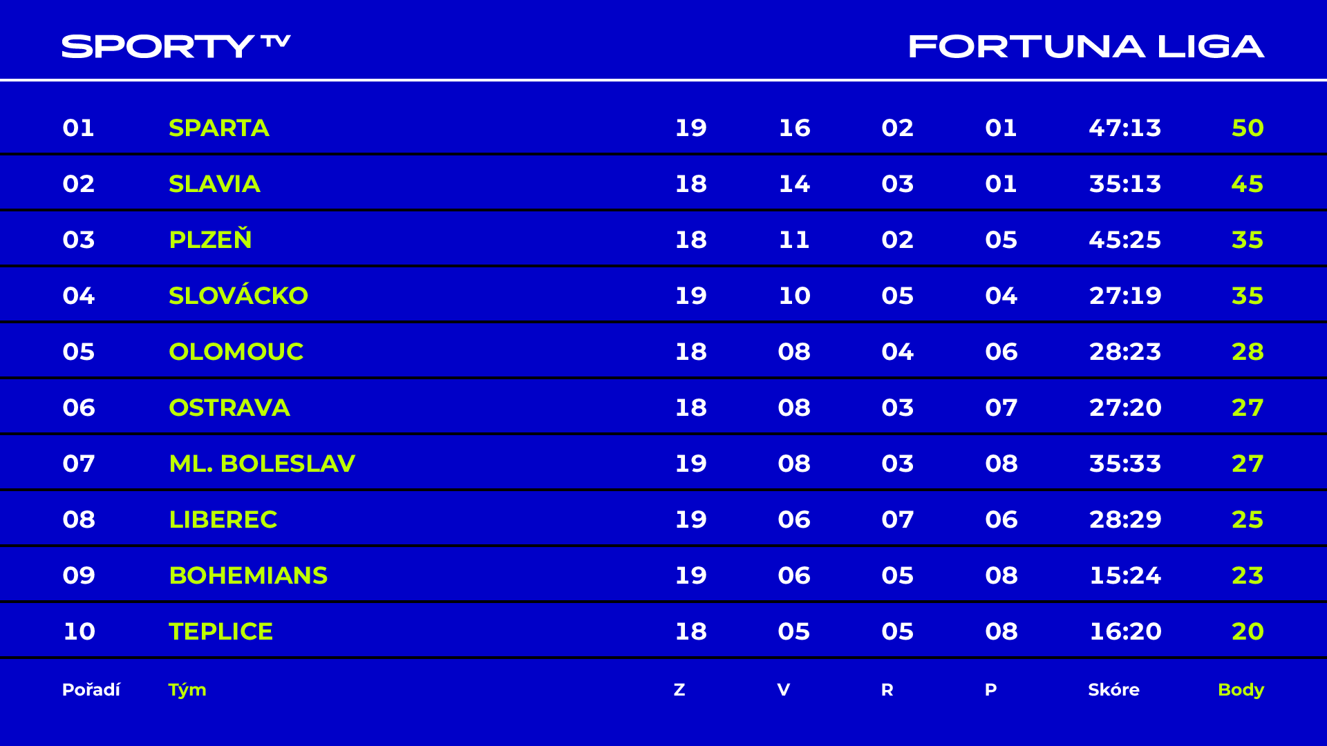
The color scheme is yellow with black text, and the program colors are inverted, i.e., blue with white text. Complementary infographic distinctions facilitate orientation in the broadcast. The typography is also contrasting. The sporty character of Pano Bold is complemented by the dynamic font Antiqua Editorial.
Time
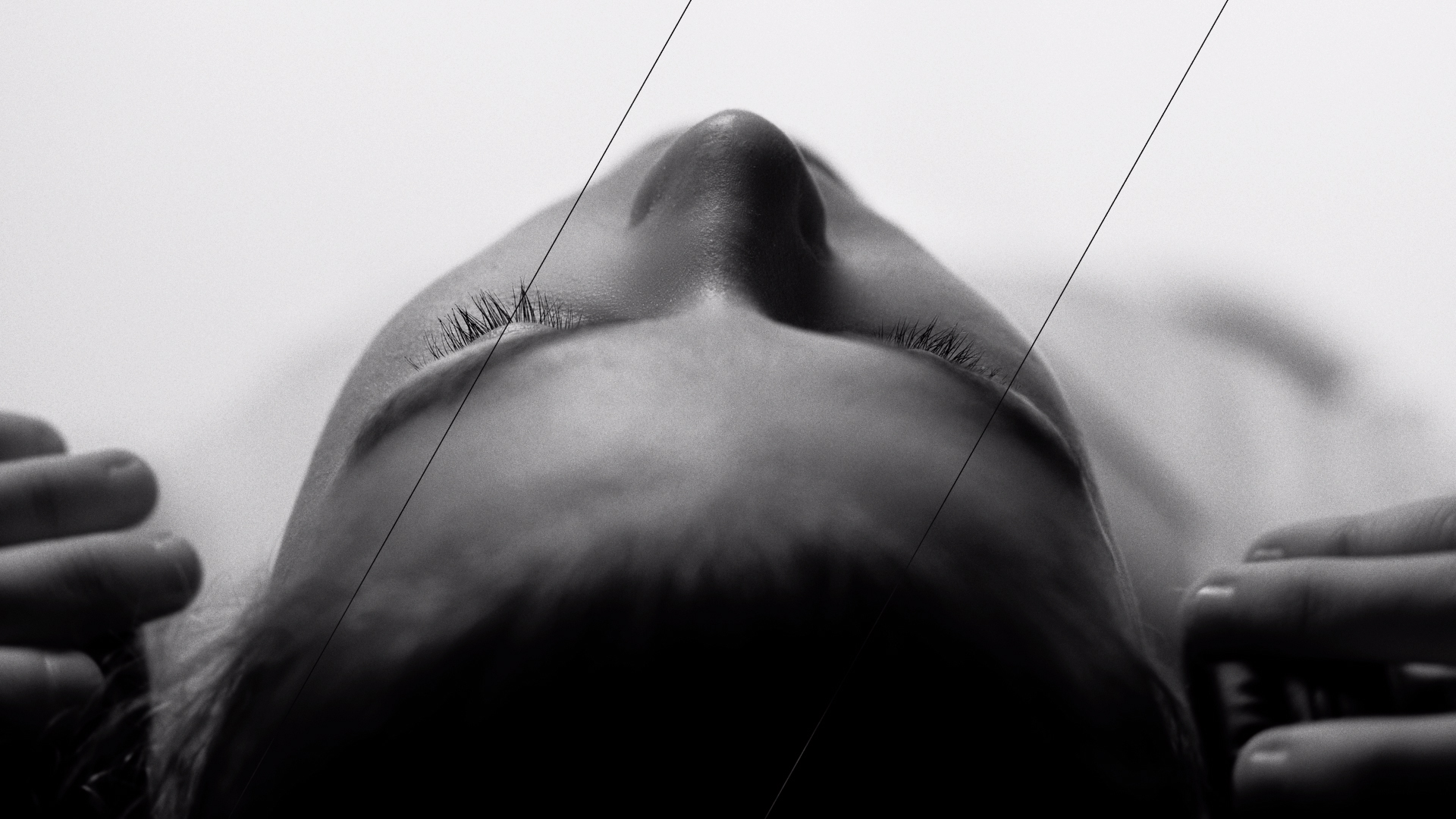
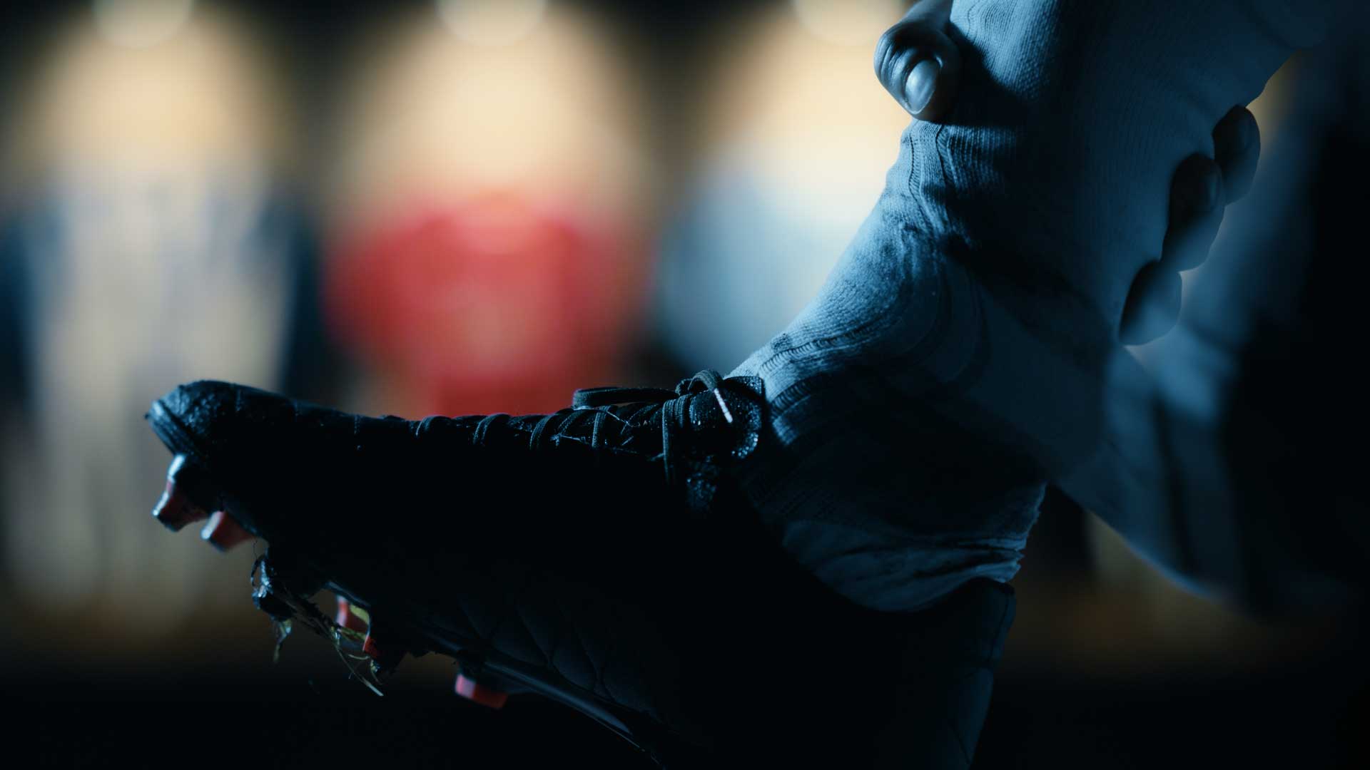
Idents are dedicated to the variable of time. They depict the trace of sports activity at crucial moments. The kinetic energy of movement transfers to surrounding elements at every moment, creating a chain reaction. A rich and vibrant color palette contrasts with the monochromatic layout.
Similar sport projects:
WTA
Flashscore
Canal+ Sport
Credits
František Polák
Jan Netušil
František Polák
Marek Cimbálník
Luisa Pánková
Marek Cimbálník
Matěj Martinec
Jan Netušil








Social