Mouvo Interactive brand
Motion design brought to life by the human eye.
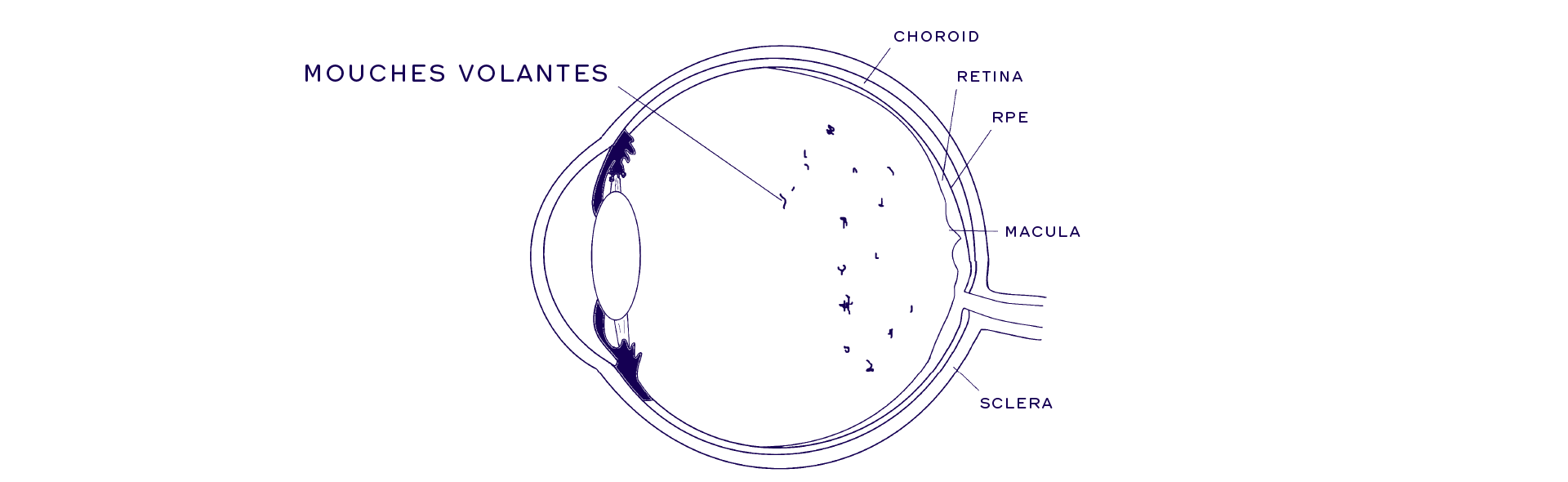
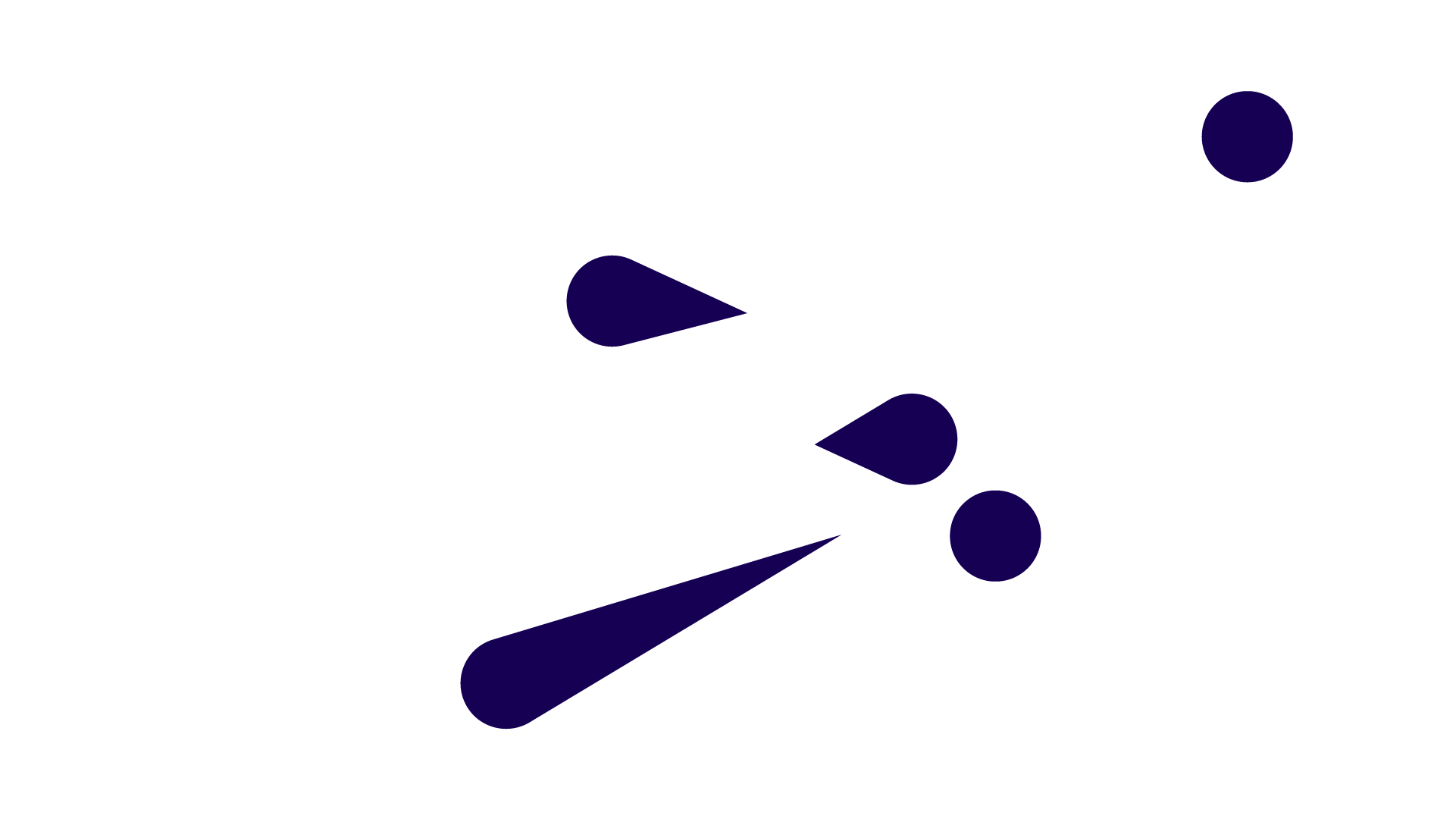
The perception of floaters is known as myodesopsia. These floaters are called Muscae volitantes in Latin, meaning “flying flies”, and mouches volantes in French. You can experience them as tiny stringy spots floating in your field of vision.
This phenomenon was the inspiration for the name and visual style of Mouvo, the motion design conference we hold annually in Prague.

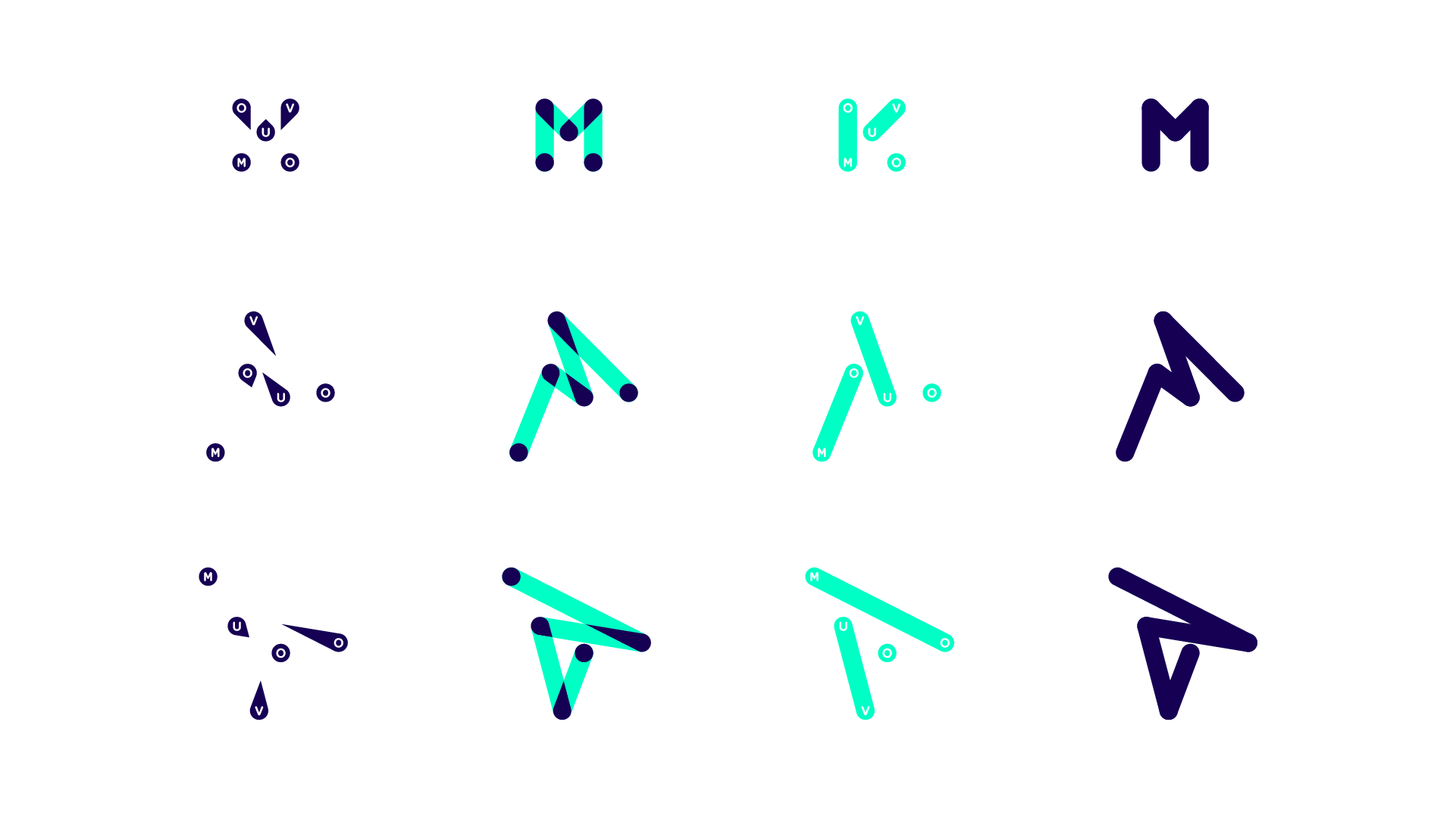
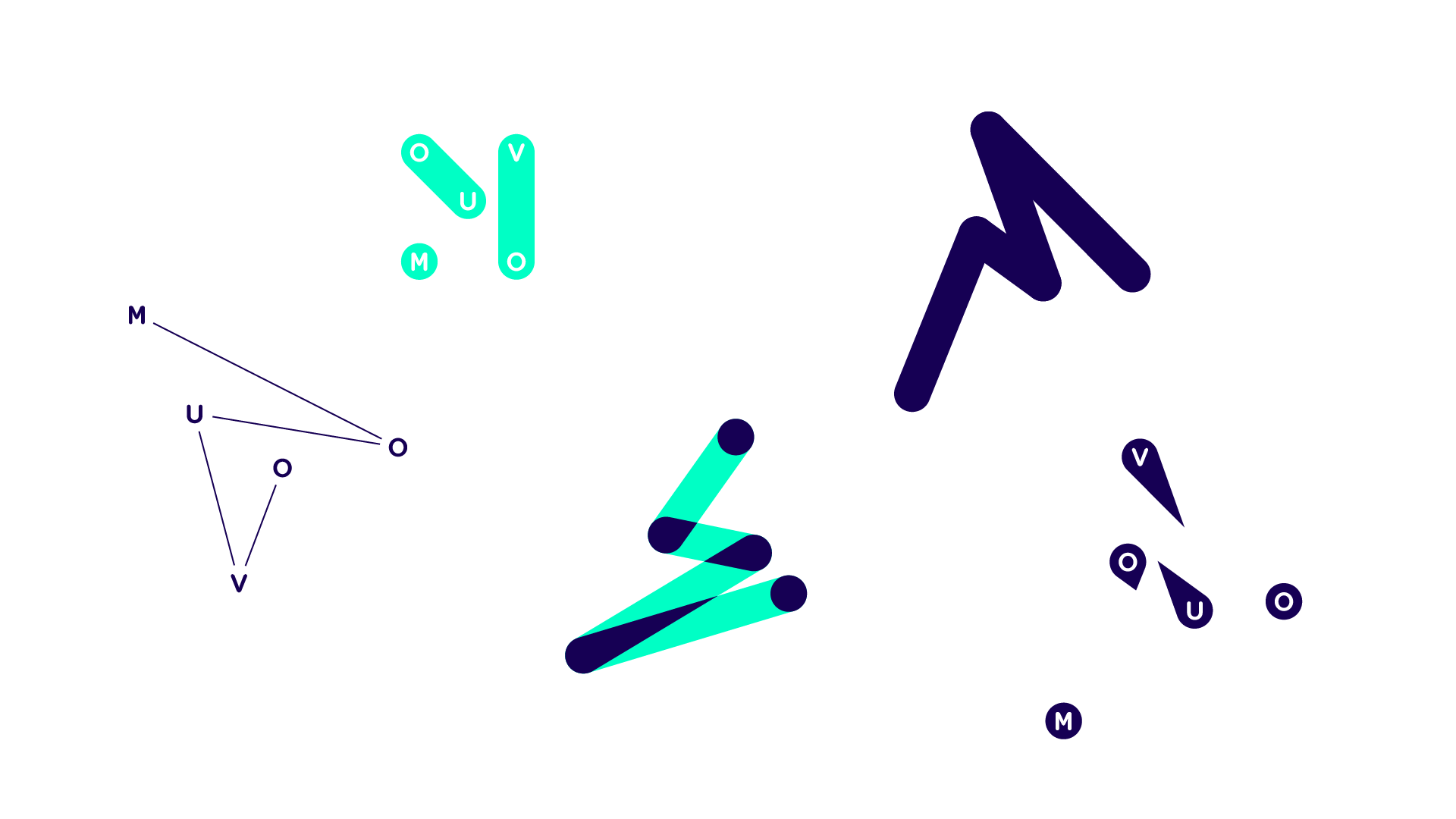
Because mouches volantes are endlessly in motion, we created a memorable principle instead of a static logo.
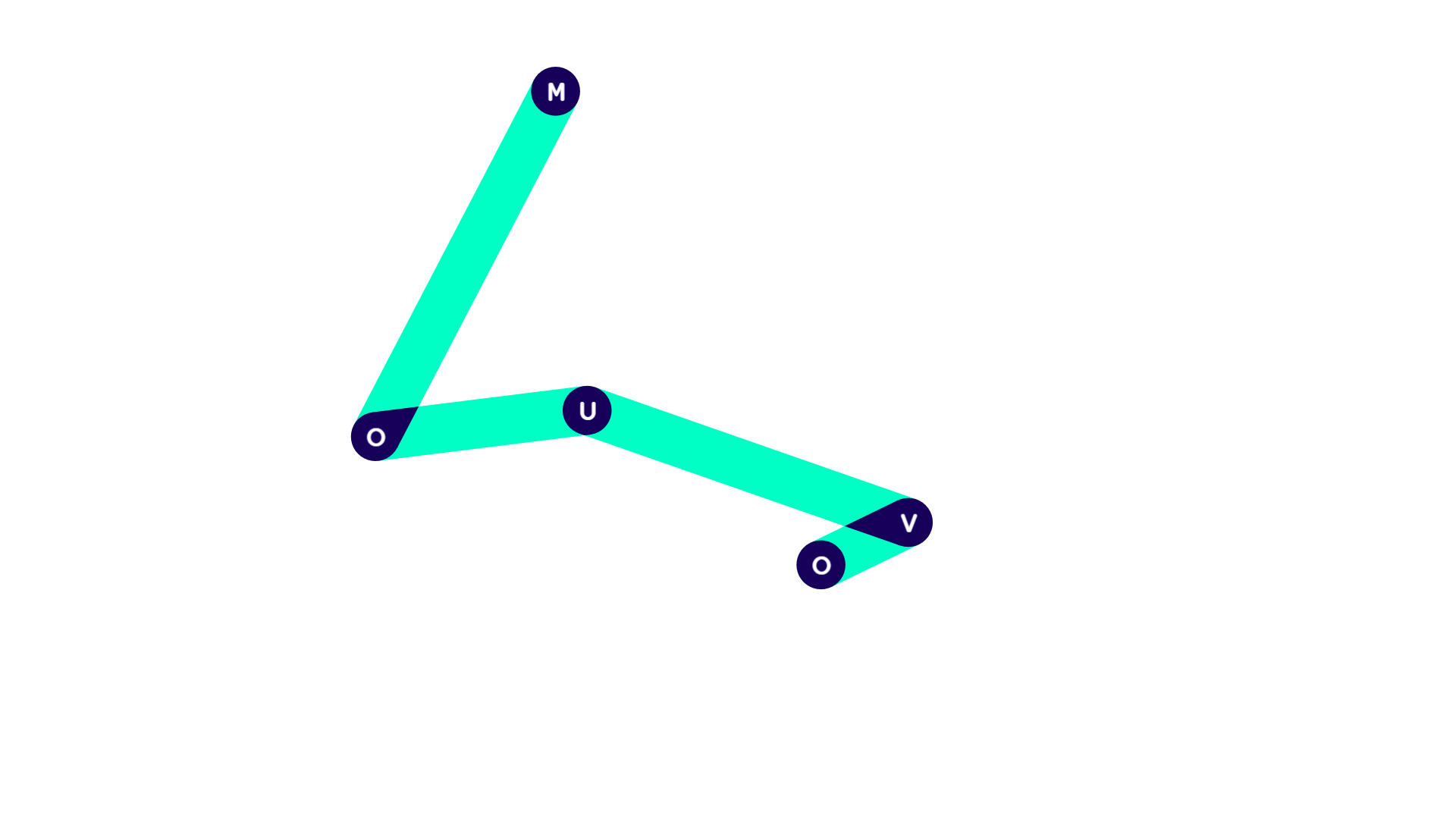
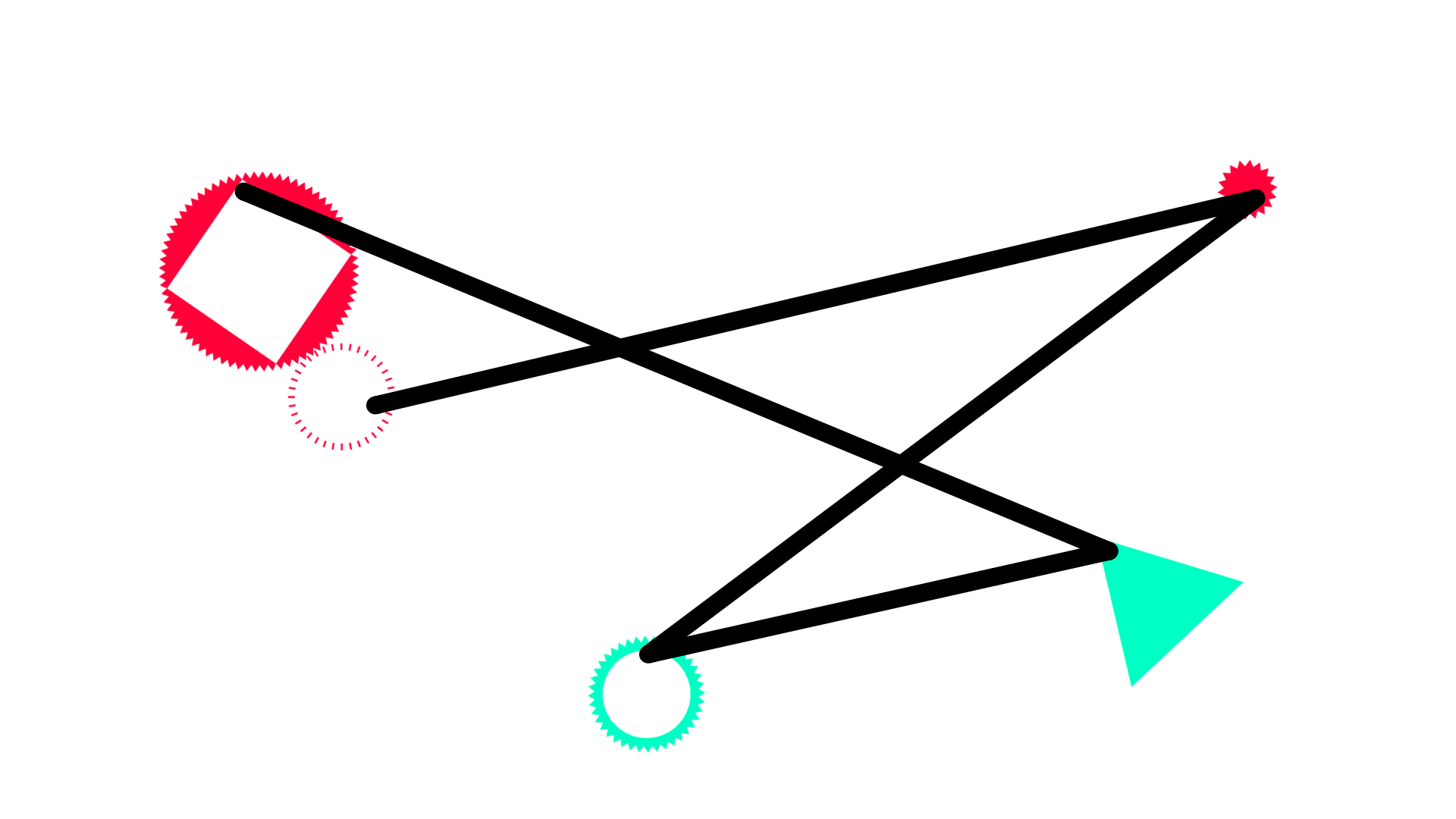
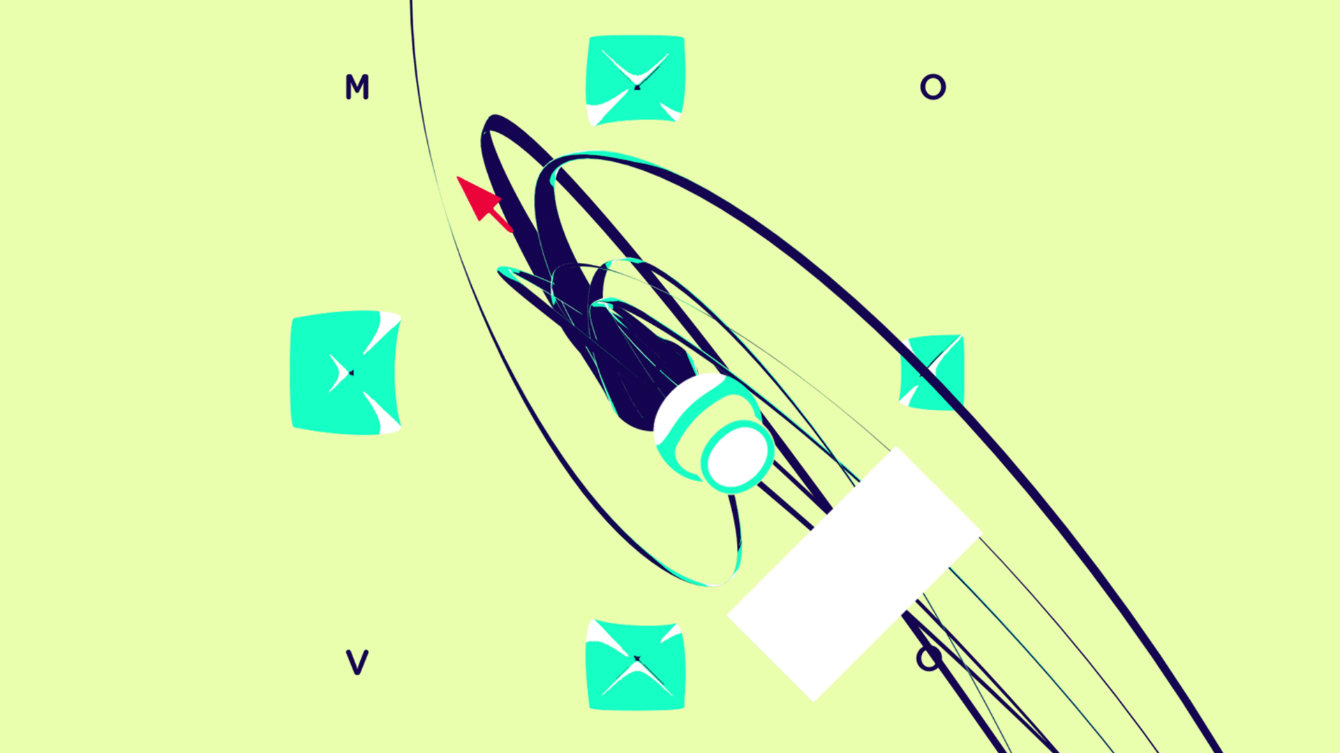
This system lies in five graphical points of the MOUVO logo, which are physically connected and react to each other when in motion.
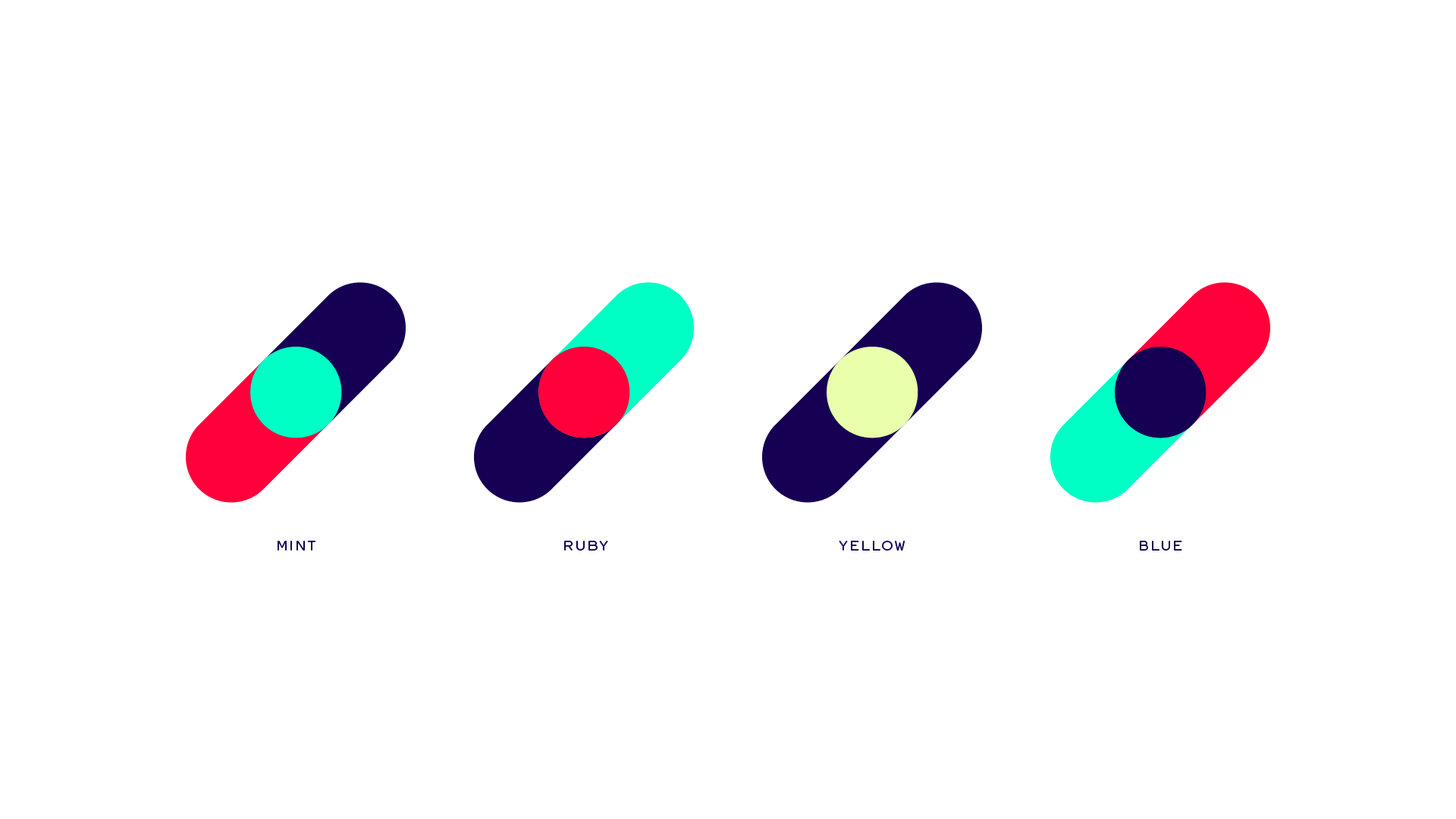
Floaters
We used the visual floaters as the first example of integration of mouches volantes into interactive visual style. The human eye can never focus on a specific floater, we made the tiny particles to persistently always avoid mouse cursor motion or any touch input. When they collide, they start to form variable structures reminding us of the real thing, as well as the principle of connected points of the Mouvo logo. It was the first output long before we launched the website, just to have something playful on the mouvo.cz domain, but we liked it so much that we ended up using it as a universal background for our site and also for some prints in merch.
2016: Mouvo begins
How to apply the variable logo system to visual style? To work with this in different media (social media, videos, jingles and conference web), we created a playable simulation as it was a real physical thing and because web nowadays allows us using various methods of interactivity on any device imaginable, naturally, this resulted in an interactive playful landing page, which is multiplatform and it is the first thing you can see, touch and play on any device when you visit mouvo.cz.
It ultimately became a tradition that we create a new landing page annually, teasing different festival theme, while using same basic principles of interconnected points.
You can play with the first logo here.
2017: Time Machine
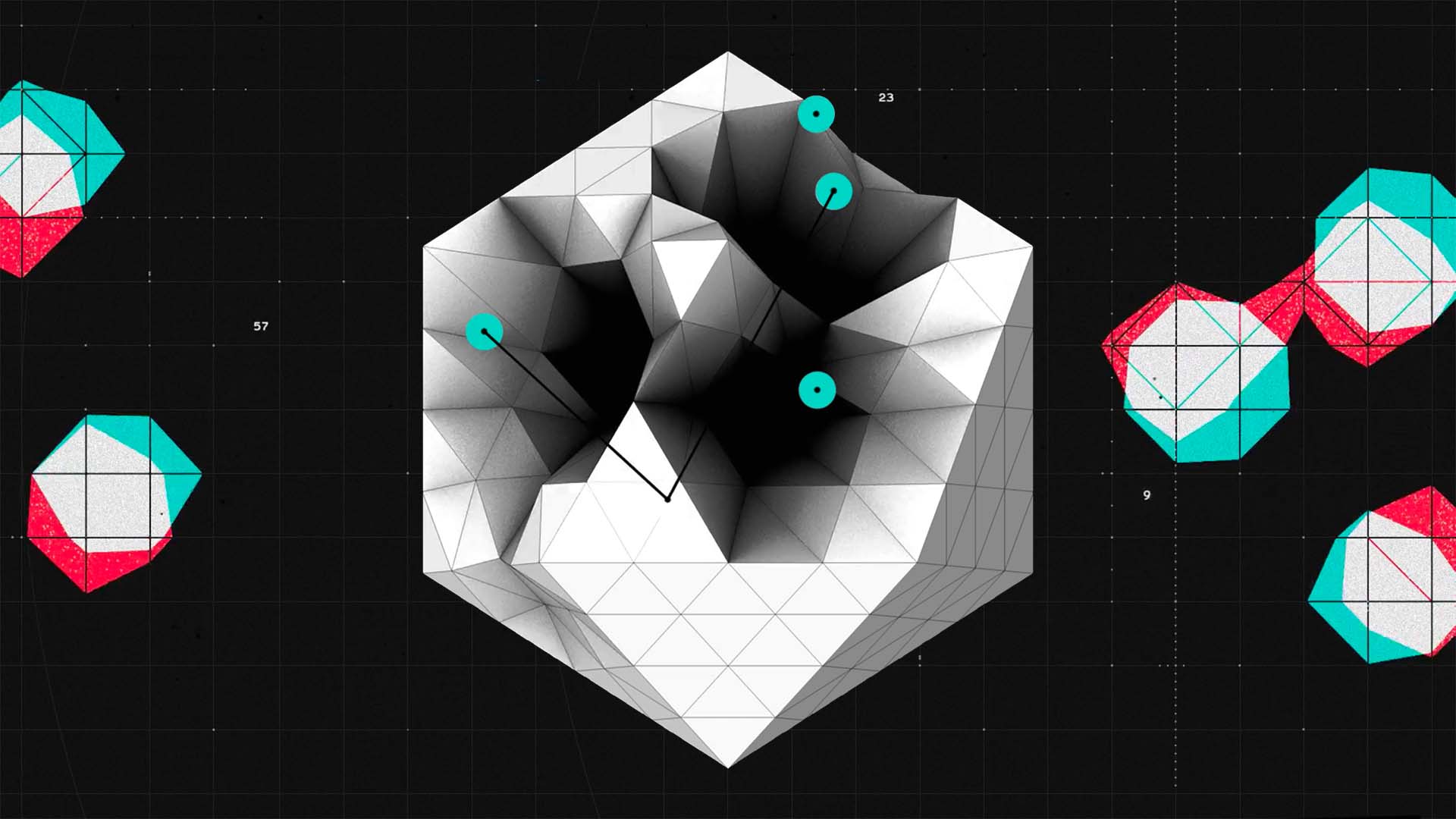
Theme of 2017 was the future of motion design. While the future was a discussion topic during the conference, the visual style was drawn from an adjustable ever changing clockwork machine. As it was second year and everybody already knew the name of the conference, we decided that we don’t need the letters in the landing page anymore. We maintained a system of five interconnected points, but this time their movement was powered by the machine you can adjust by moving the wheels.
You can try it here.
2018: DIY and teamwork
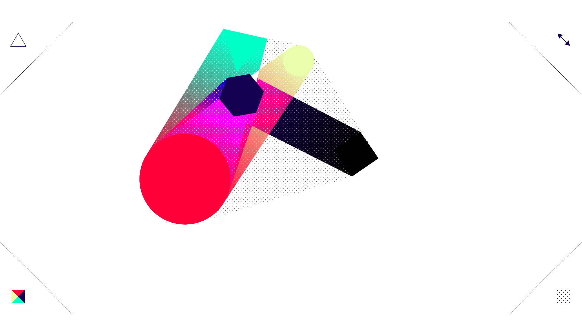
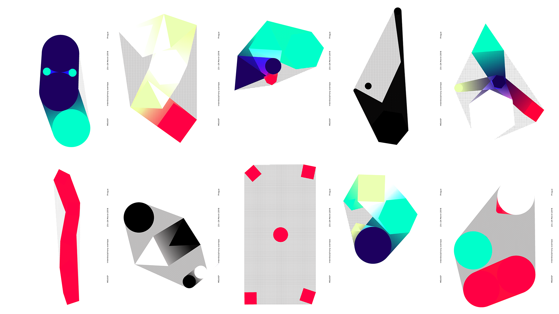
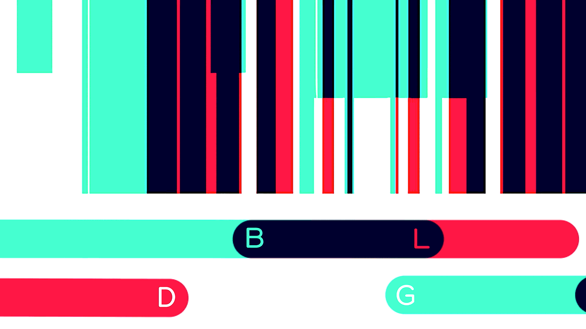
What we love even more than creating videos and interactive installations is crafting playful tools. We have put in place some basic visual rules and let people design their own poster by tweaking form, color, texture, and size of five physically connected elements. Message of this volume stated how different disciplines must work together to create something beautiful.
Every poster was saved into database during the conference and printed out for visitors to take home with them.
2019: hungry for knowledge
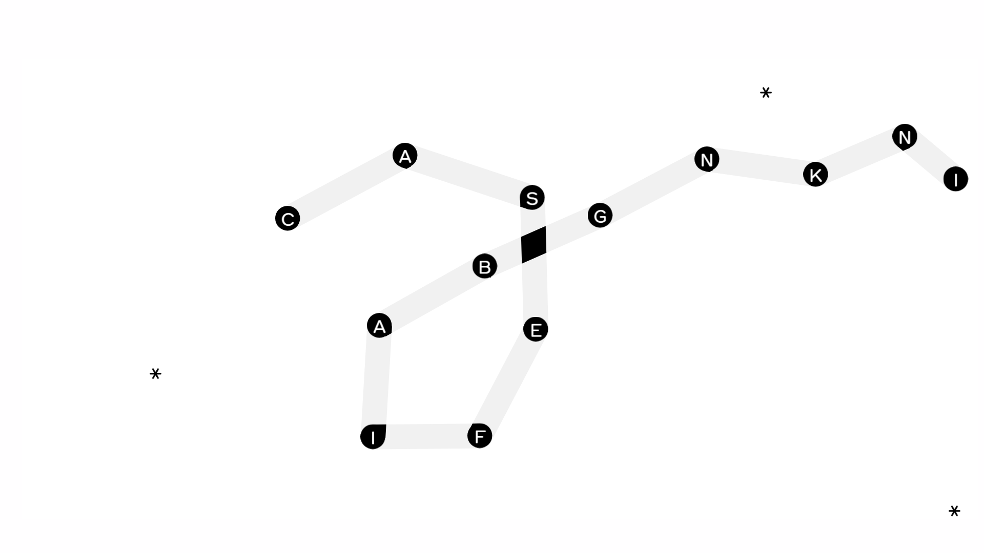
Theme of education inspired us to hold homage to the old famous snake game based on our physical engine.
For 2019, we decided to let go off the five elements and returned to the letters. This time, by composing them, you create your own sentences, but watch out for the traps!
Play it here.
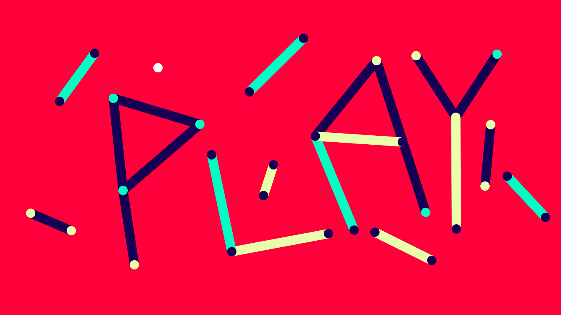
2020: time to play
Last but not least, the 2020 theme was Play. We always wanted to create a visual music synthesizer and 2020 was the right time to do it. Once again, we used interconnected points, but this time, they represented notes. You can arrange them by moving the joints around, forming a labyrinth for the white ball. You can aim and shoot the ball, and its collision with any line produces a tone.
Every color stands for a particular instrument. As you change the length, the pitch changes along as if you pull a string.
Credits
Jiří Netušil


Social