ZOOM
Pinch in. Pinch out. Creative logo design.
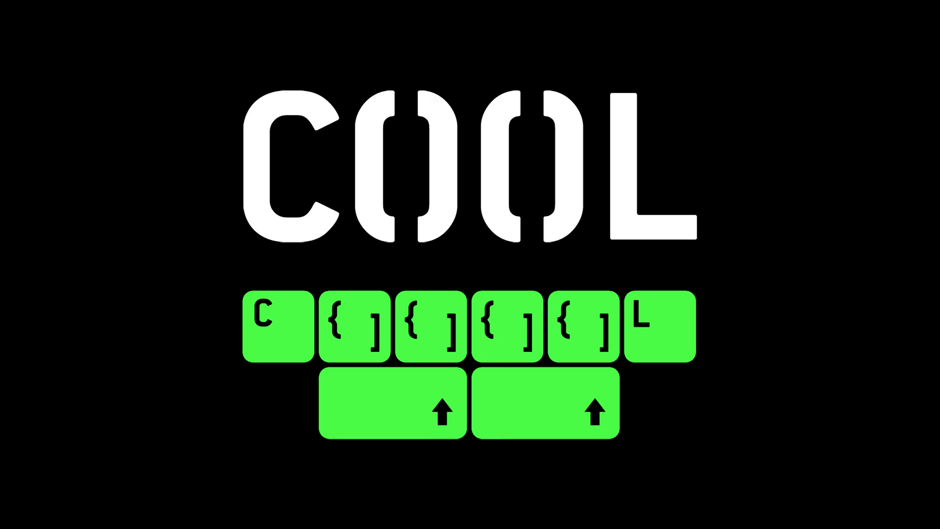
We found visual inspiration in the name of the popular science and documentary channel ZOOM. Traditionally, zooming is a way to look closer and deeper at an object or vice versa. In the digital age, the zooming motion is analogous to the interface gesture of pinching in and out. We harnessed the principal of this gesture to animate the letters of the ZOOM logo.
The two O’s are the moving blocks of the pinch in and out feature. They optically open up space in the logo for dynamic content – typographic or graphic. This stylistic animation is the core principle of the channel’s visual identity. A simple yet elegant approach that provides space for the zooming motion to reveal a vast diversity of content.
Read more
Credits
Created
2013Client
FTV Prima HoldingArtdirection
Lukáš FišárekMarek Cimbálník
2D animation
Petr BradáčekLukáš Fišárek
Idents artists
Lukáš FišárekMarek Cimbálník
Lukáš Veverka
David Vrubel
Jakub Sporek
Postproduction
Jan NetušilJan Drozda
Lukáš Fišárek
Music
Jan ČechtickýProduction
Vlaďka Cimbálníková


Social