Prague Spring 2026
Interactive Brand
The idea behind the visual identity for the Prague Spring campaign was clear from the beginning: to create a living identity for a music festival that brings the city of Prague to life for one month.
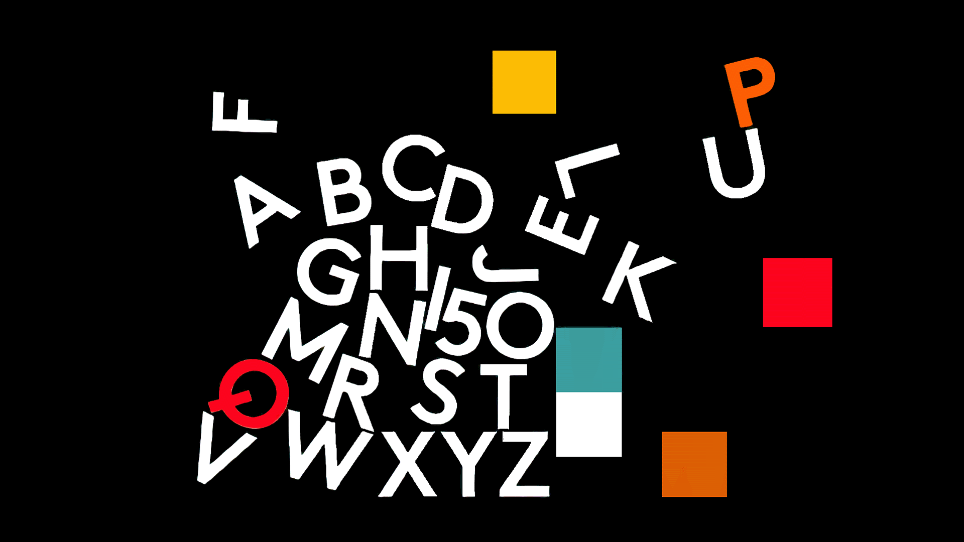
The central element of the brand is the iconic logo by František Muzika — the letter “f”, a symbol of Czech design. By animating it, we aimed to highlight its musical character and give it new life.
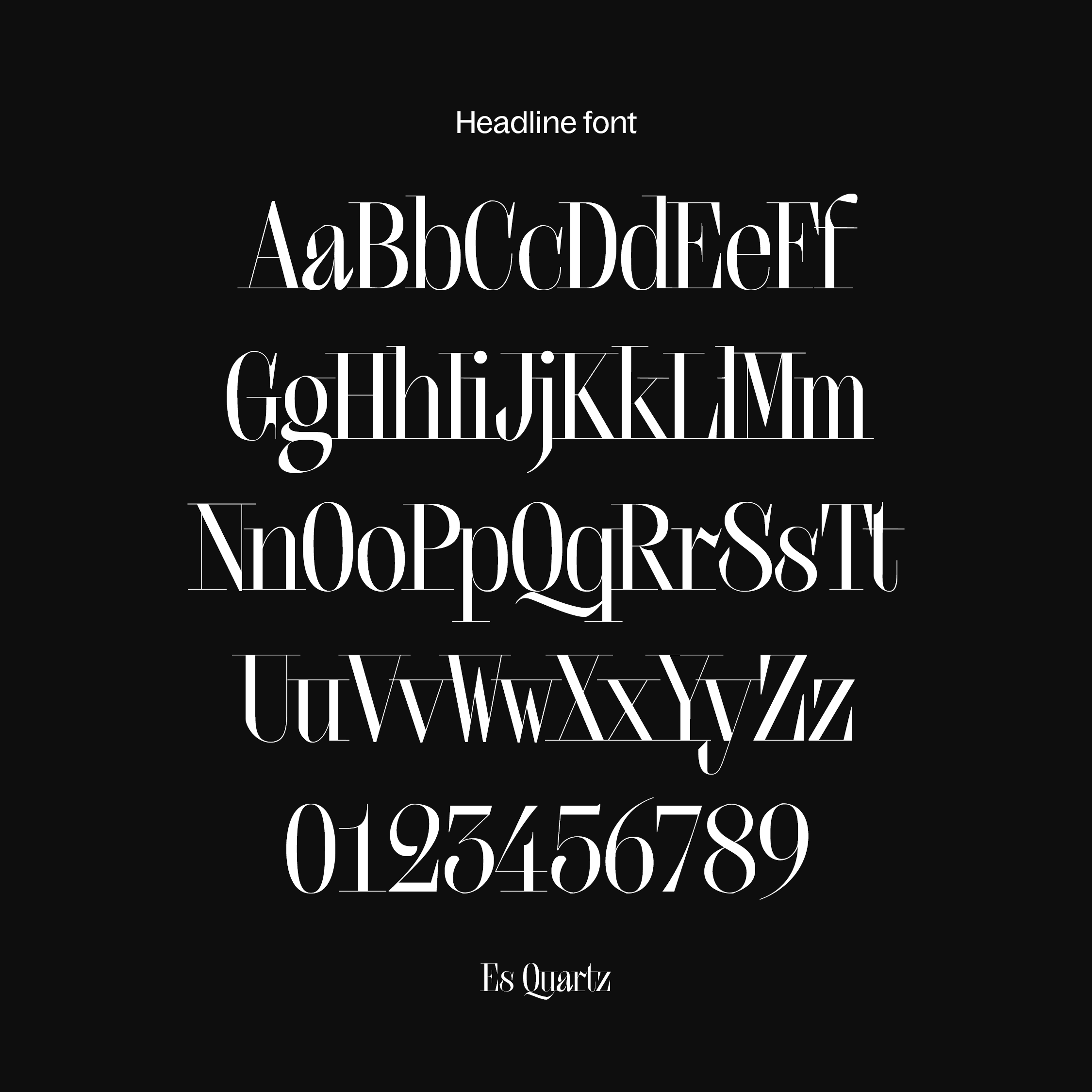
The letter “f” is divided by a thin line referencing musical notation, while the brand typeface Quarz, with its extended serifs, suggests the feeling of being written directly into a score.
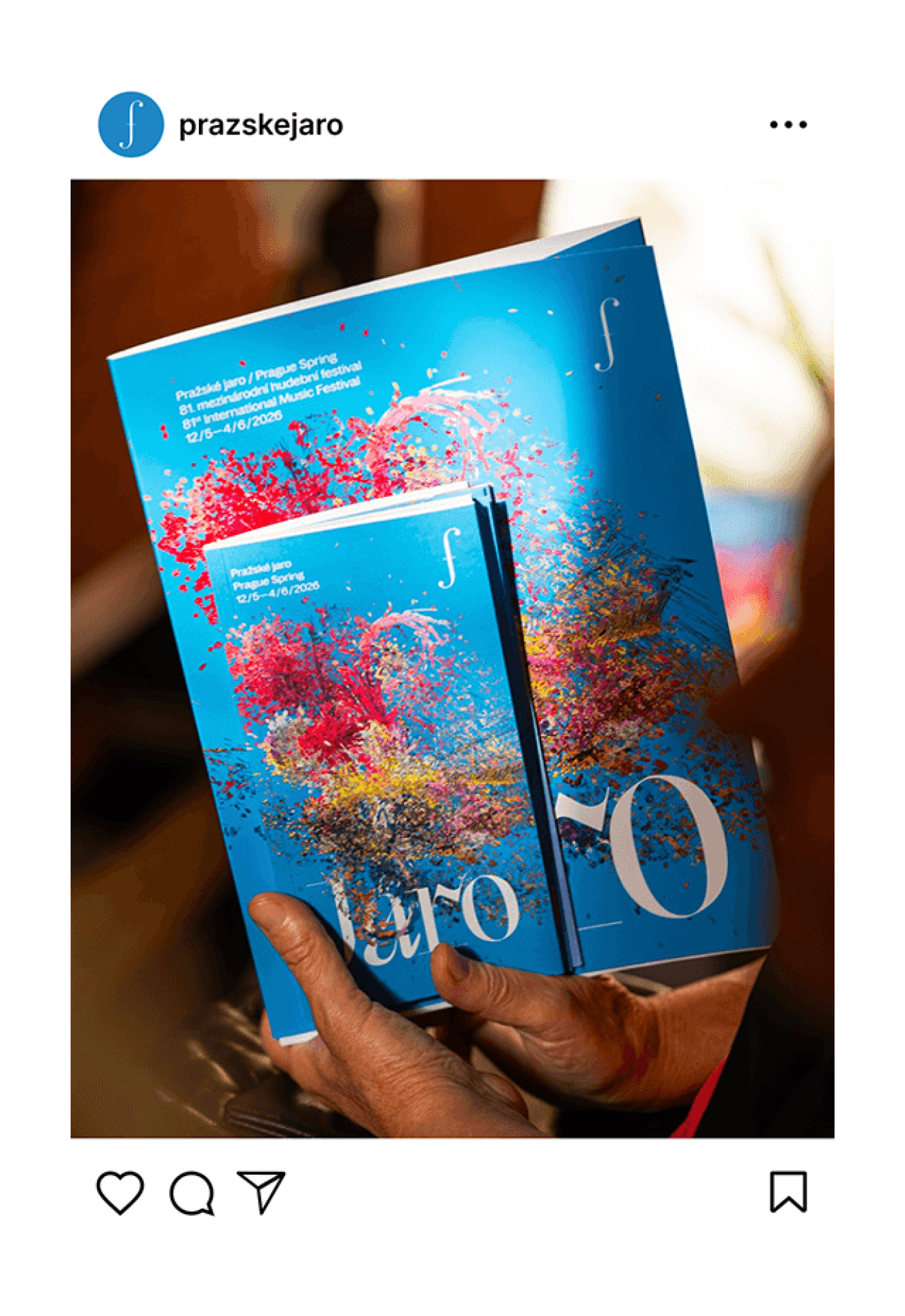
Another key cornerstone of the brand is the definition of a distinctive “spring” blue.
Read more Read less
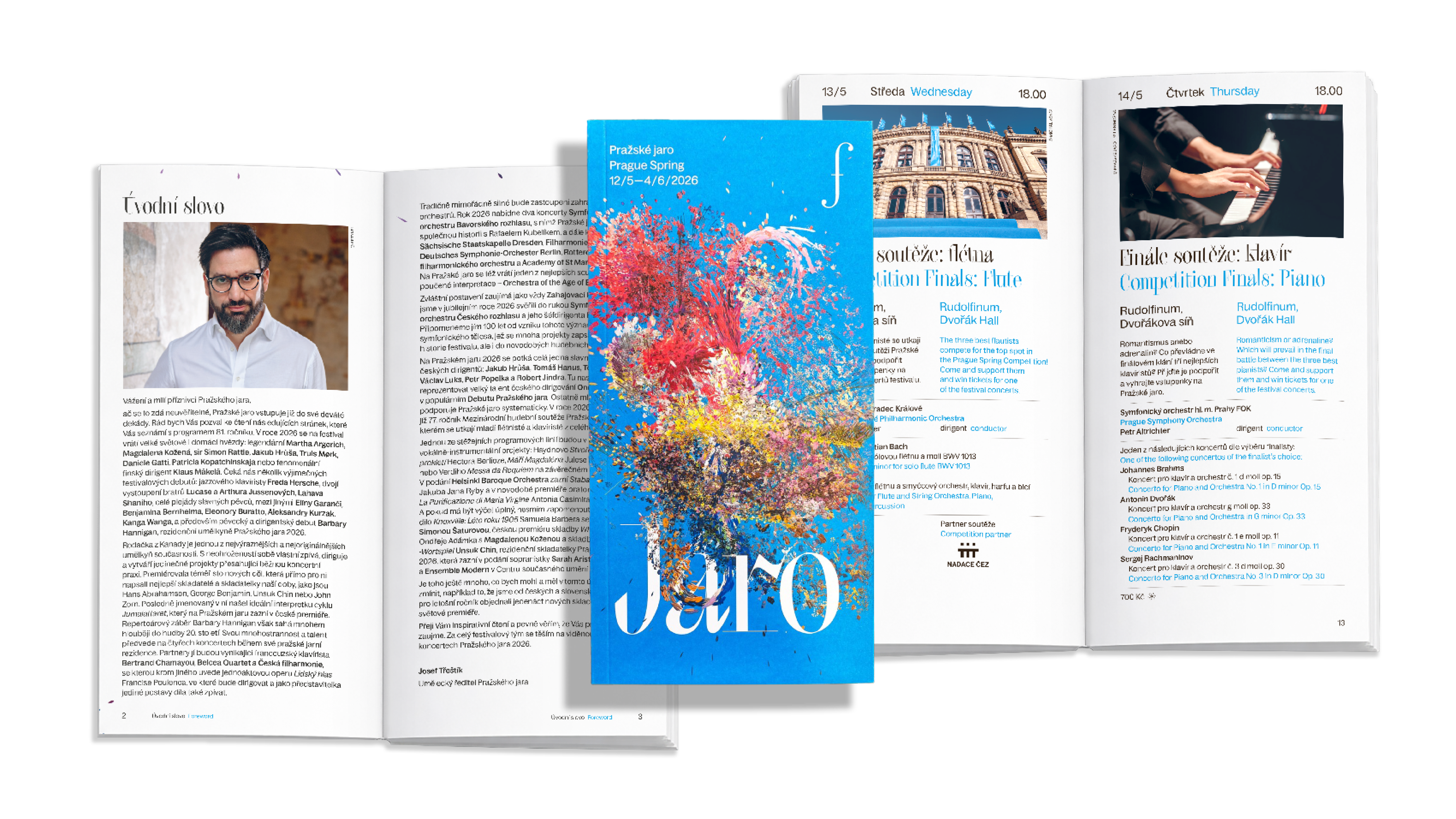
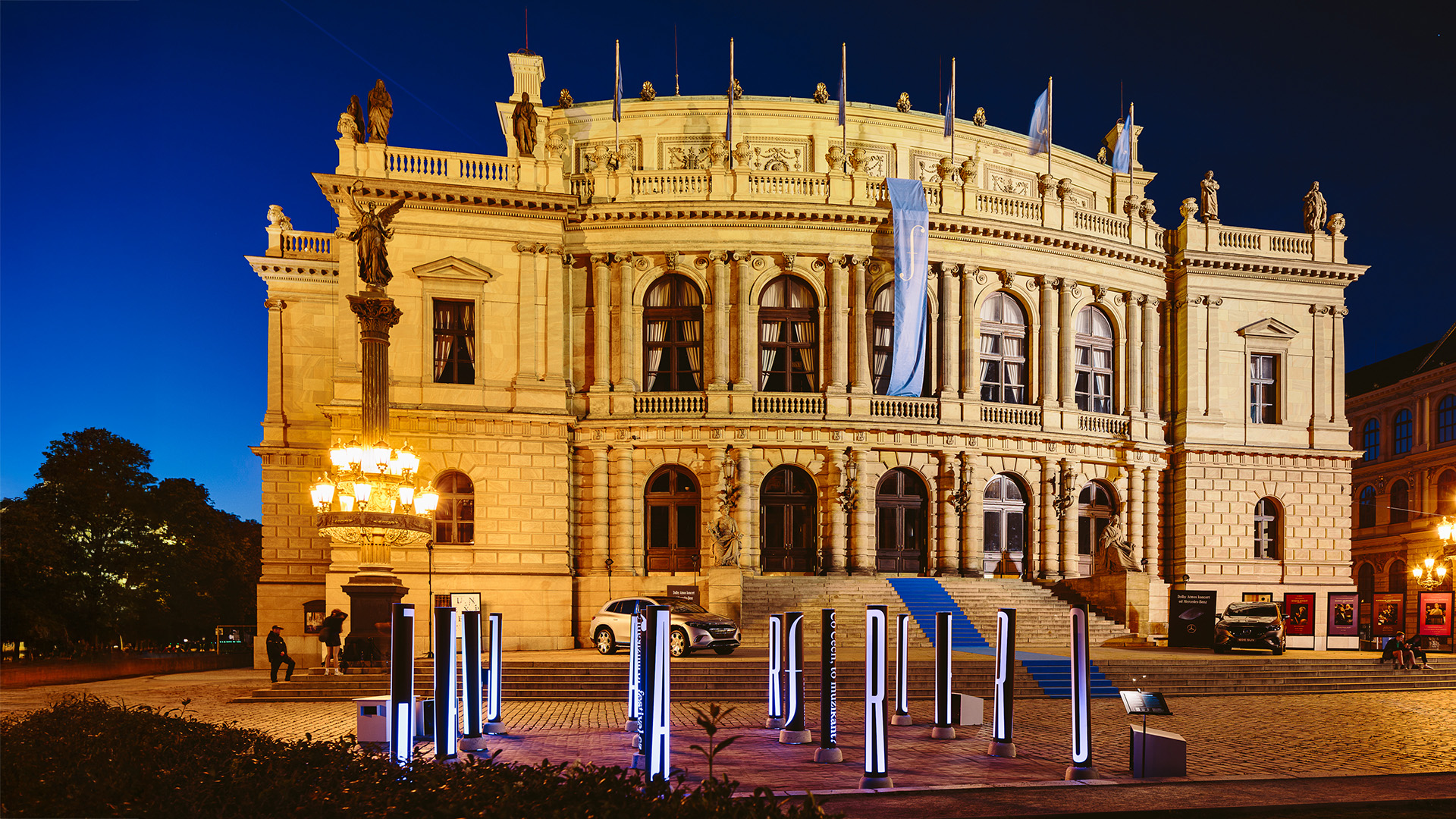
The communication campaign is built around the abbreviation “Jaro” (“Spring”) — a striking and positive symbol of the festival that reflects its energy and long-standing tradition, repeated every year. The festival always begins on May 12, and whether someone is already a fan of classical music or not, everyone likes spring.
This allows the Prague Spring campaign to reach new potential audiences through a simple and accessible tag.
The campaign is meant to function like a melody, with each message acting as a chord that deepens the story.
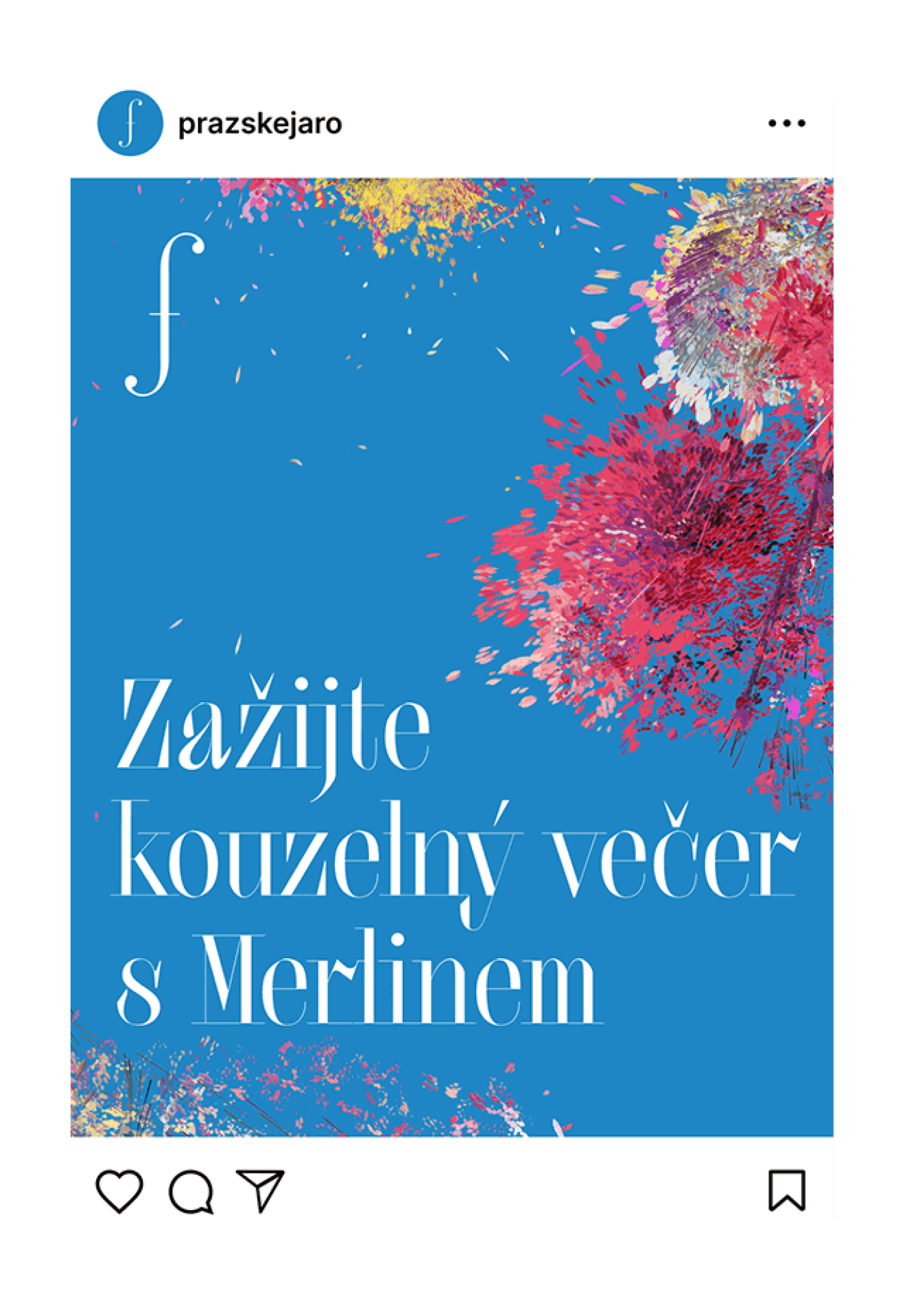


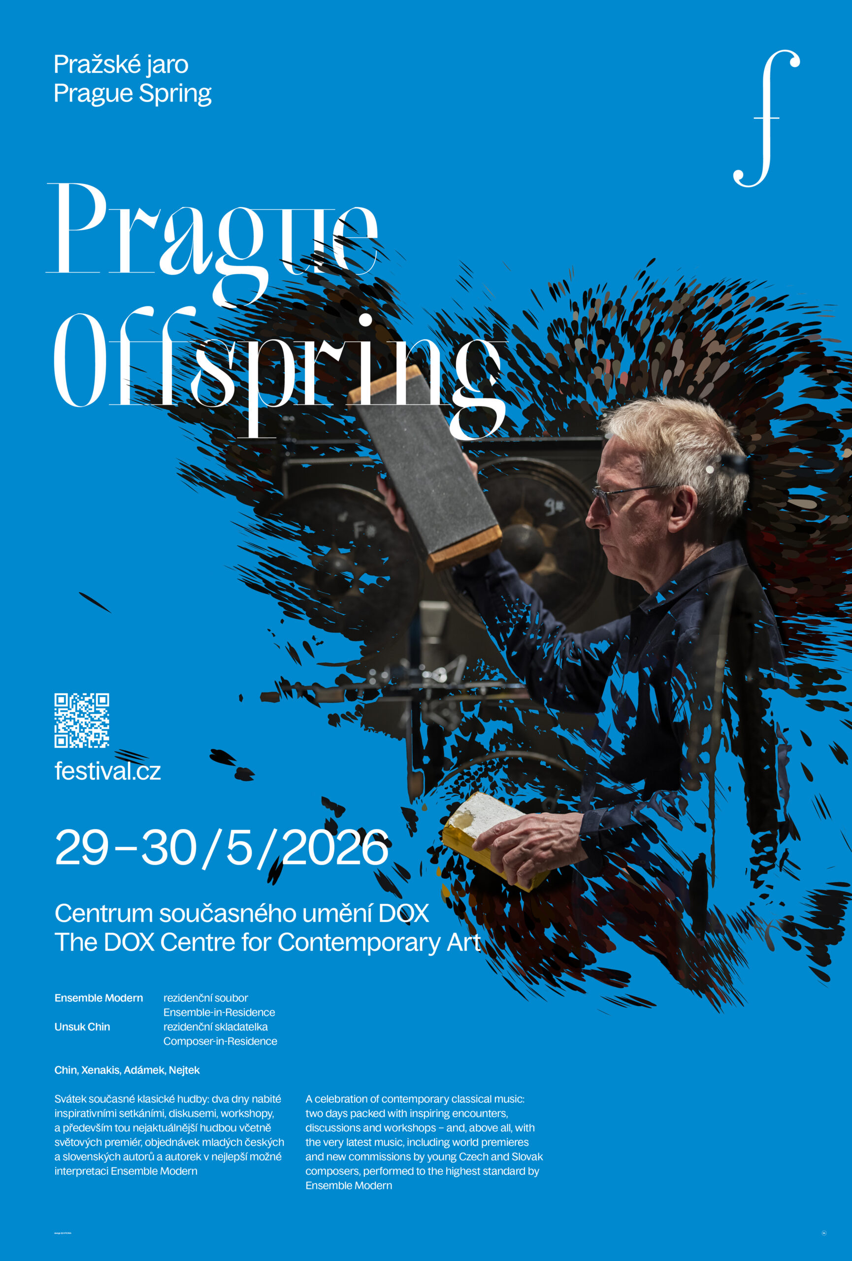
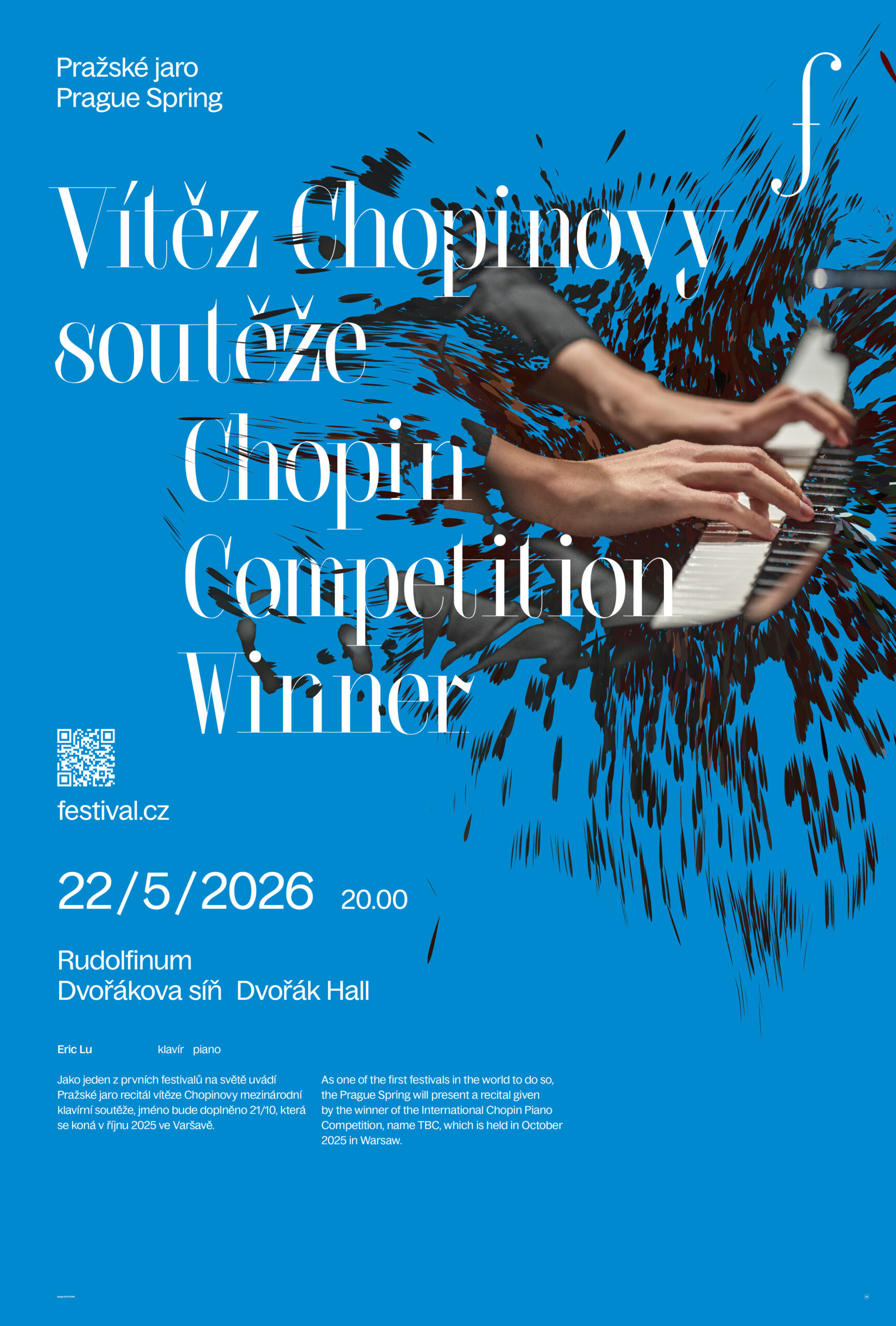
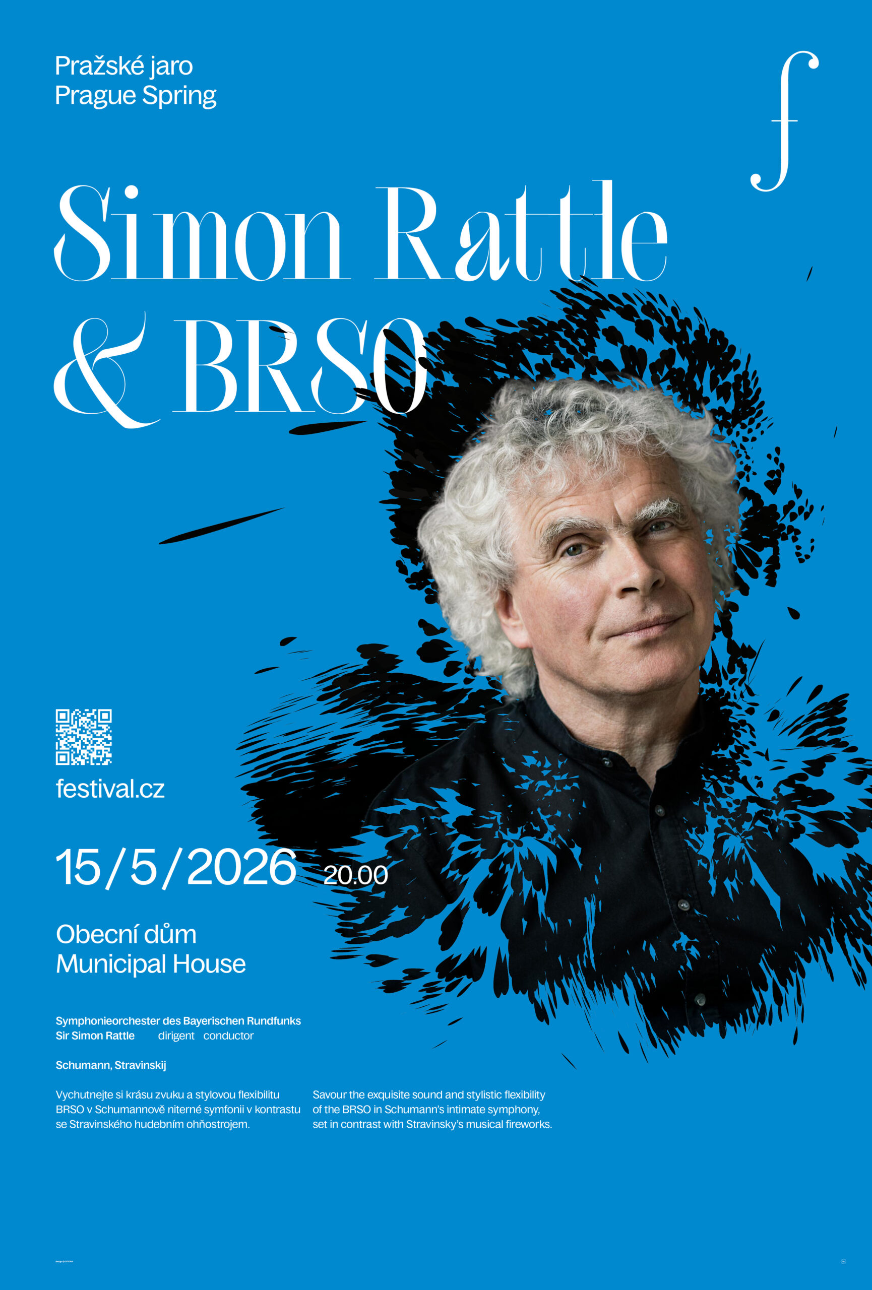
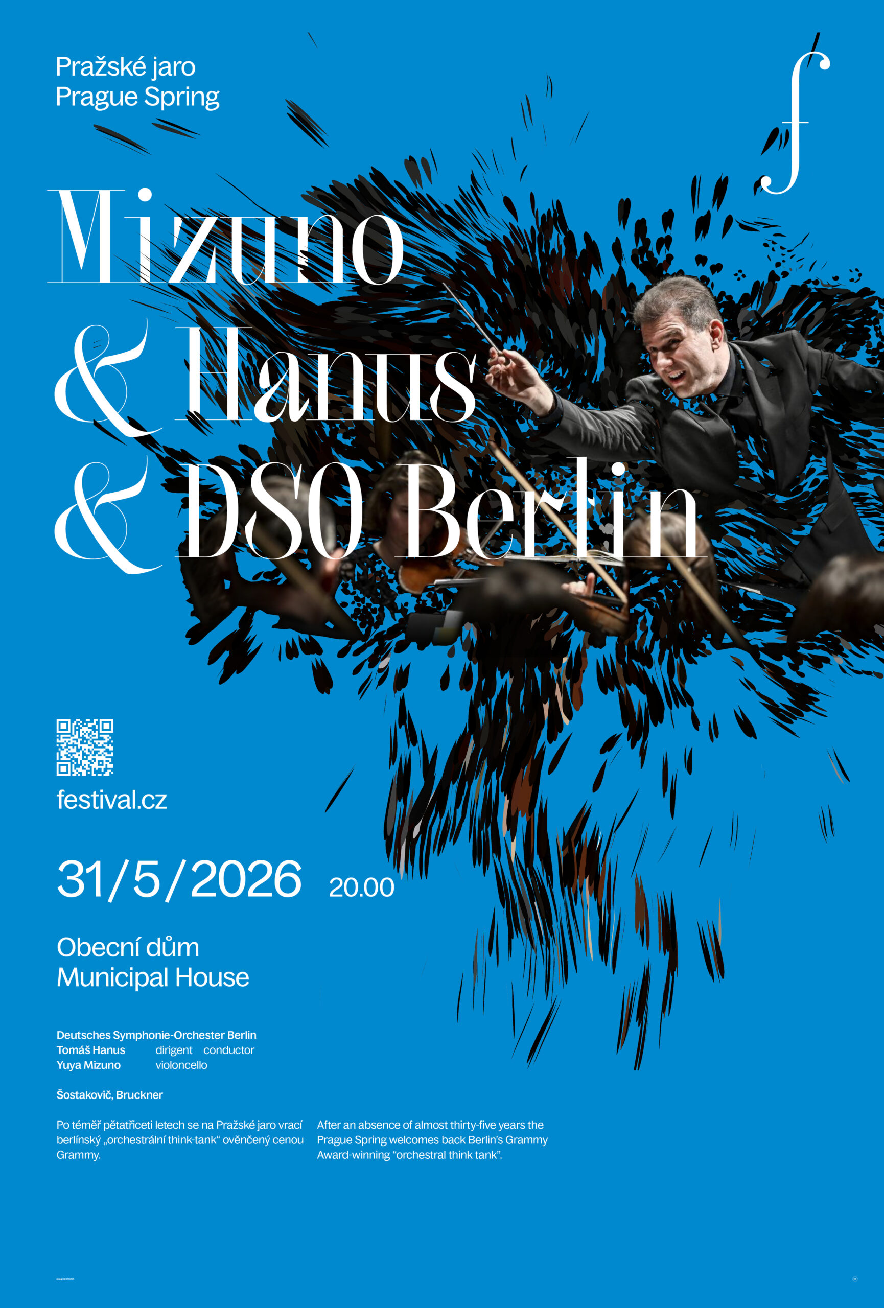
This is where the interactive layer comes into play. The graphic motifs — grounded in the connection between music and spring — offer a wide range of visual forms that can evolve over the years.
For the first edition of the new cycle, abstract floral elements grow directly from music, evoking the elegance and fragrance of May.
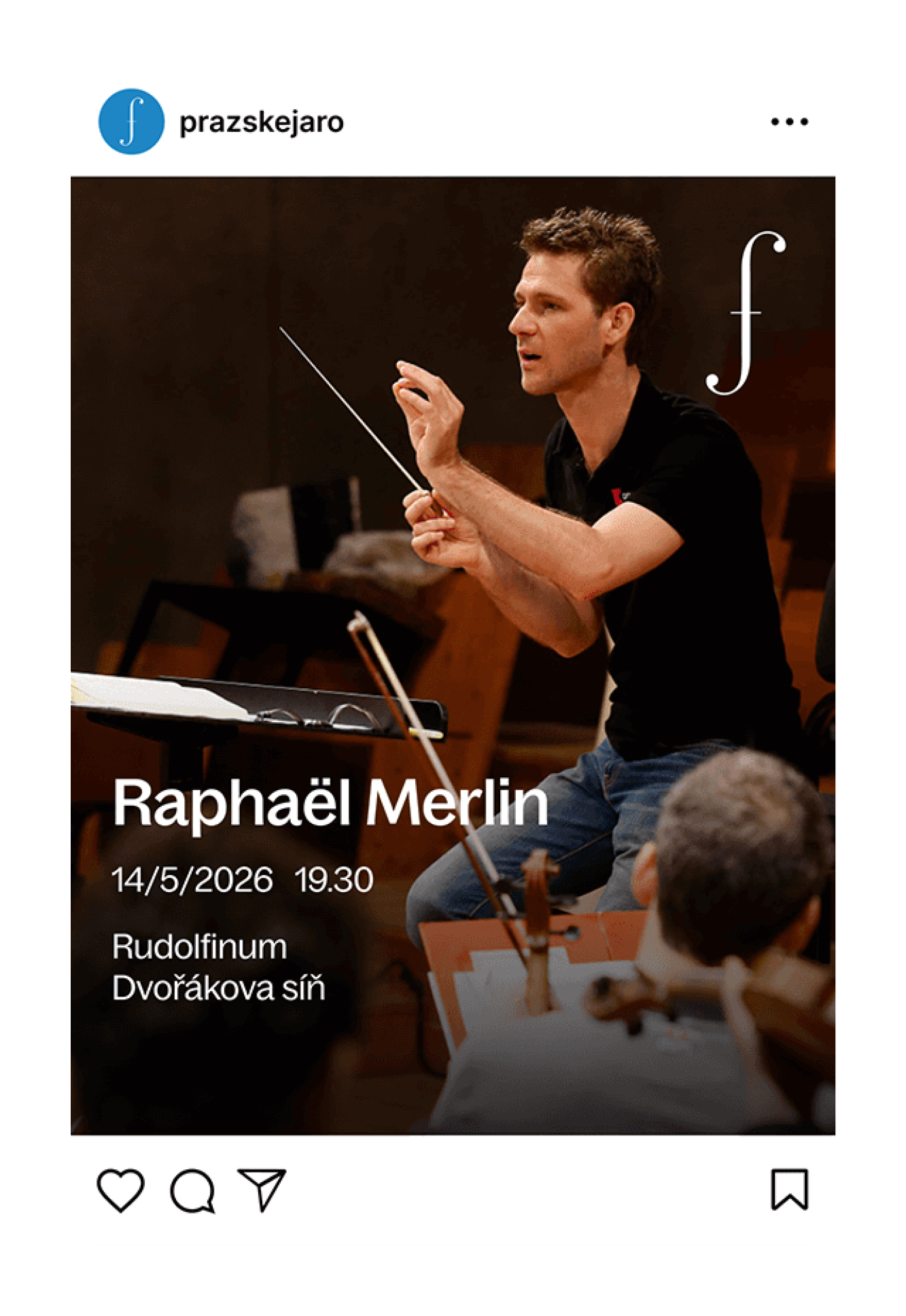
The graphics are procedurally generated through musical play or movement — such as the motion of a conductor’s baton or a bow. Another layer allows visuals to be created from live audio recordings or even photographs of the performer. The result is a consistent visual language that extends across the entire visual spectrum of the festival.
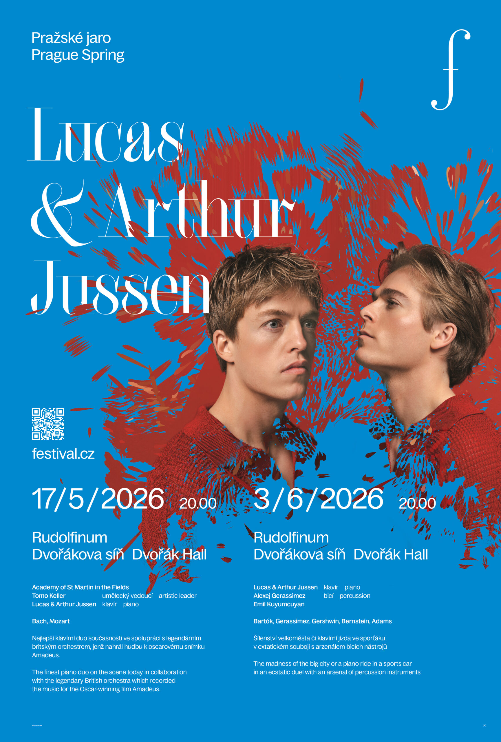
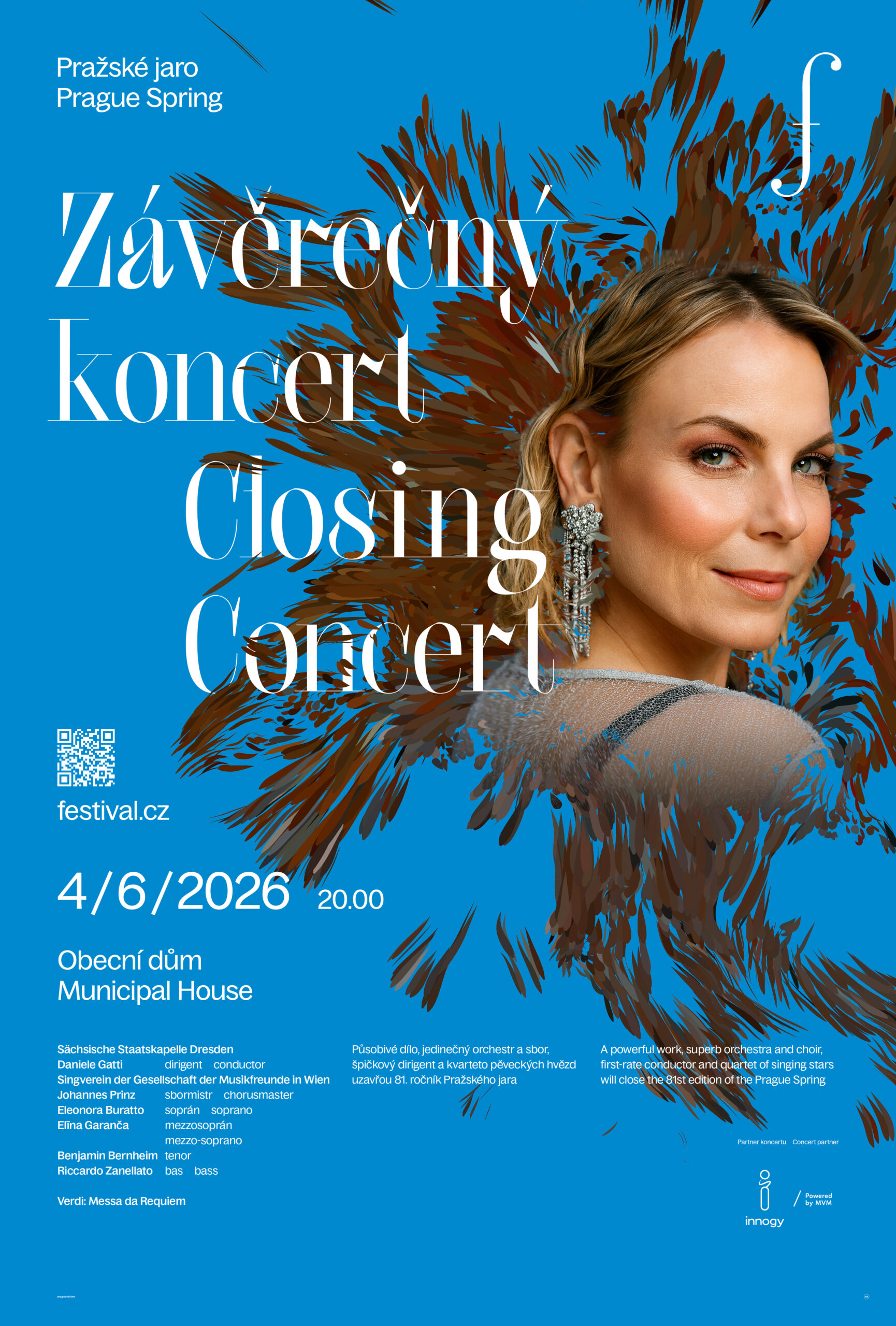
Every poster can transform into a sound animation — just activate it with your phone.
The visual layer can be integrated into the performance as a real-time audio-reactive mapping, transforming the stage into a dynamic extension of the music.
Credits
Matuš Buranovský
Vlaďka Cimbálníková
Matuš Buranovský
Jakub Šilhavý
Jakub Šilhavý
Markéta Choma


Social